

Women in Industry
Overview
Women in Industry is a research-driven social impact project about women’s representation, career paths, and barriers in industrial sectors of Kazakhstan. The project is based on a large-scale study that explored how women work, grow, and are perceived in traditionally male-dominated technical fields.
My role was to turn complex research findings into a clear visual system, data storytelling framework, presentation, and digital experience. The challenge was to make a serious social and economic topic accessible, credible, and emotionally engaging for different audiences: industrial companies, employees, students, media, experts, and the general public.
The project combines research interpretation, UX/UI thinking, data visualization, editorial design, visual identity, and public communication. It transforms a large body of data into an understandable narrative about women in industry — from statistics and systemic barriers to personal stories and broader social impact.
Client
Steppe Up
Impact metrics
Social Impact Campaign
Industry
Art Direction
Brand Design
Research & Analytics
Data visualisation
Visual Communications
UI/UX Design
Infographics
Presentation Design
Role
The project combined research scale, communication reach, and visual storytelling into one campaign format. Key project metrics included:
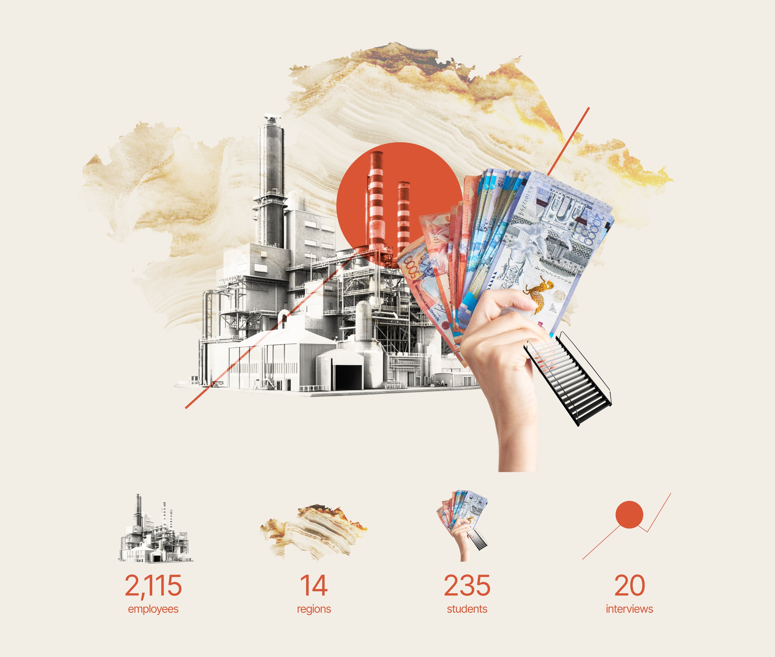
2,115 employees of industrial enterprises surveyed
14 regions of Kazakhstan covered
235 students from technical universities and colleges surveyed
20 in-depth interviews with women working in industrial sectors
5 industrial areas represented: oil and gas, mining and metallurgy, mechanical engineering, automotive manufacturing, and light industry
50+ presentation slides designed
Multiple formats developed: research presentation, data visualizations, infographics, website, media materials, and public communication assets
The most important result was not only the number of materials produced, but the way the project made complex data easier to understand and discuss. The design helped transform research into a format that could work for conferences, media, online audiences, and public communication.
Business & Social Context
Industrial sectors play a critical role in the economy, but the representation of women in technical and production-related roles remains a complex and often underdiscussed topic. The subject touches employment, education, career growth, workplace culture, stereotypes, access to opportunities, and the visibility of women in industrial professions.
The challenge was that this topic could easily become too academic, fragmented, or difficult to read. A traditional research report would not be enough to reach a wider audience or create public attention around the issue. The project needed a format that could speak to experts and business stakeholders, while also remaining understandable and engaging for people outside the industry.
The goal was to make the research visible, readable, and discussable — not only as a set of findings, but as a communication platform that could support public awareness, media coverage, professional dialogue, and social impact.
Objective
My task was to transform research data into a complete visual communication system. This included structuring the content, developing a visual identity, creating data visualization principles, designing infographics, building a large presentation, and adapting the project for an online format.
The main objective was to make complex research easy to understand. The design had to help audiences quickly read statistics, compare findings, follow the logic of the research, and connect data with real human stories.
The project also needed to feel distinctive and memorable. It had to reflect the industrial topic without becoming heavy or outdated, and at the same time communicate the human side of the research through portraits, stories, emotional accents, and accessible visual language.
Research Foundation
The project was based on a study conducted in February 2025 by SteppeUp, a Kazakhstan-based strategic communications agency, with the involvement of experts from industrial and energy companies, as well as representatives of the academic community.
The research explored the real position of women in technical and industrial fields. It combined quantitative surveys and qualitative interviews to collect data about workplace experience, career barriers, motivation, education, professional development, stereotypes, and the perception of women’s roles in industry.
The quantitative stage included 2,115 employees of industrial enterprises from 14 regions of Kazakhstan. The study covered oil and gas, mining and metallurgy, mechanical engineering, automotive manufacturing, and light industry. In addition, 235 students from technical universities and colleges were surveyed to understand how younger specialists perceive industrial careers.
The qualitative stage included 20 in-depth interviews with women working in different industrial sectors. These interviews helped add personal context, emotional depth, and real professional stories behind the statistical data.
Research Interpretation
A key part of my work was to translate the research into a clear content structure. The data included many different layers: numbers, trends, barriers, expert insights, student perspectives, and personal stories. My task was to organize these materials into a logical narrative that would be easy to follow.
I approached the project as a user journey through the research. The experience had to guide the audience from the broader context to specific findings, from statistical data to individual voices, and from problems to conclusions.
This helped turn the research from a collection of separate facts into a structured story. Each section had its own role: introducing the topic, explaining the context, showing key numbers, visualizing insights, highlighting personal experiences, and leading the audience toward a broader understanding of women’s role in industry.
Data Visualization System
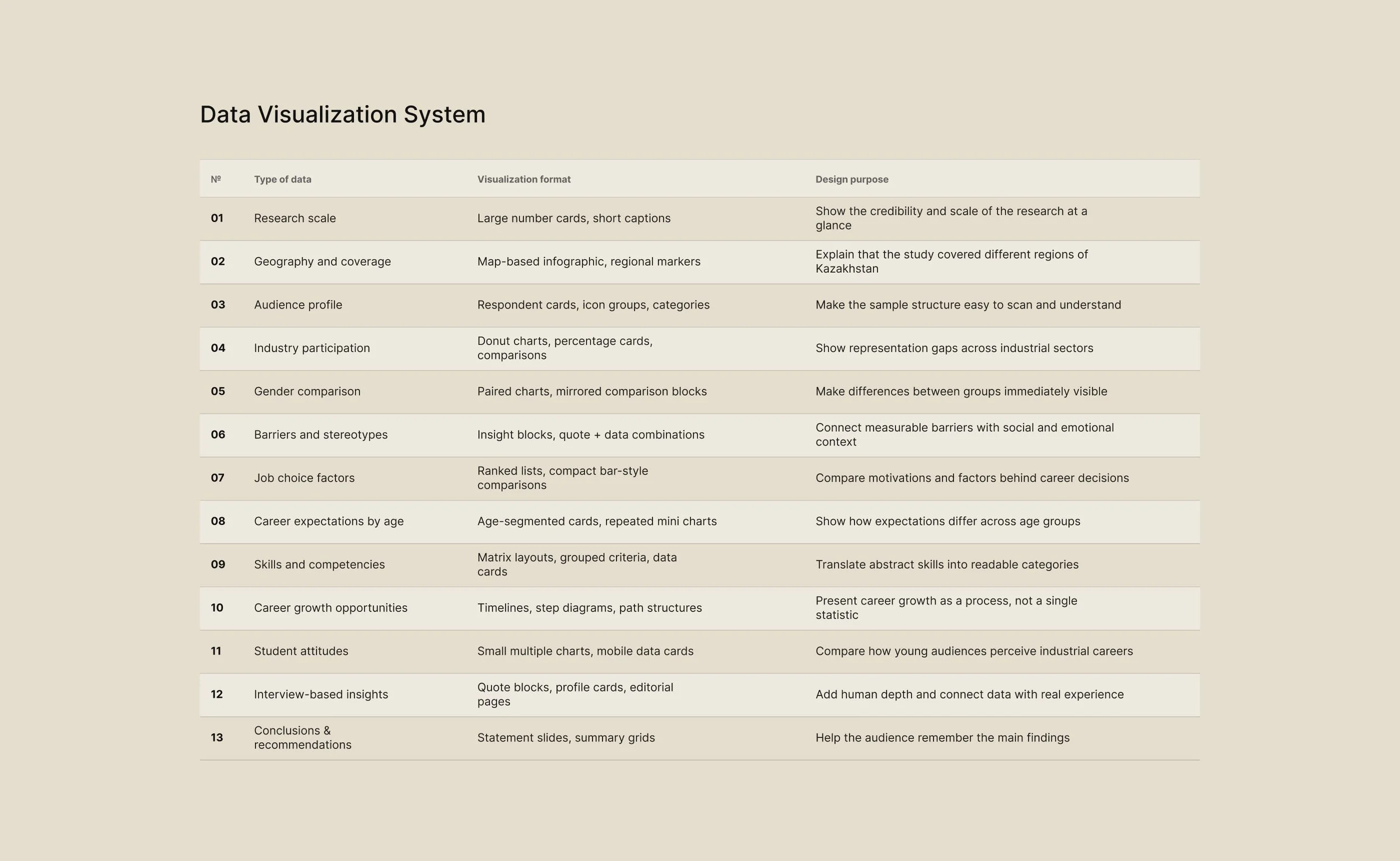
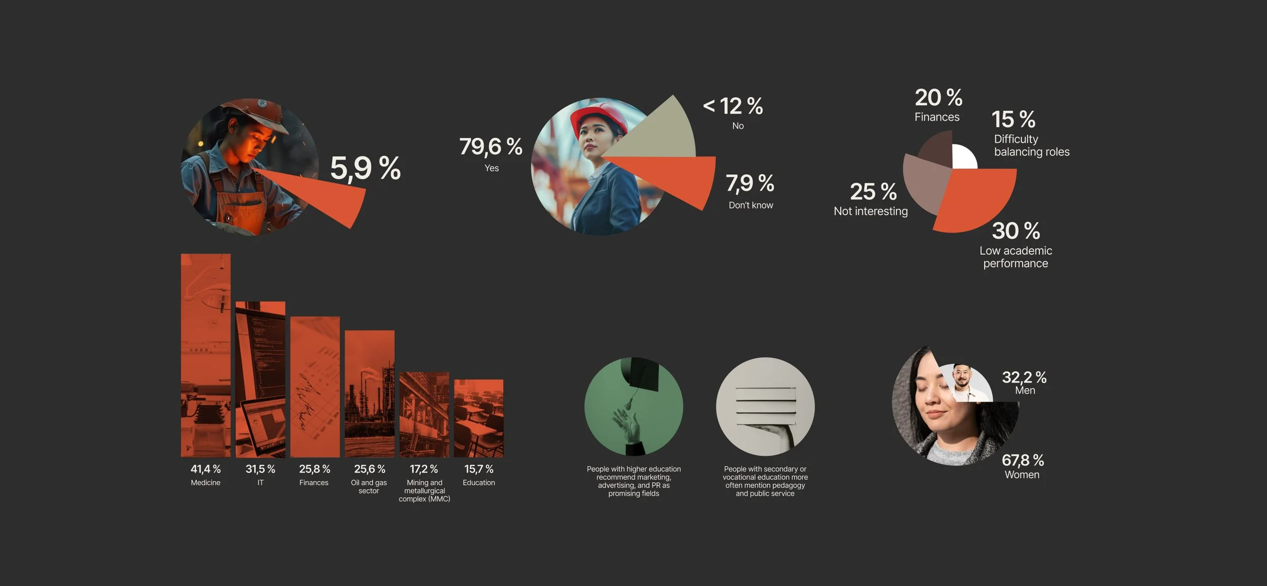
Data visualization became one of the central parts of the project. The research contained a large amount of quantitative information, and the design system had to make this information readable, accessible, and visually engaging.
I developed a system of charts, diagrams, data cards, comparison blocks, infographics, and visual summaries. The goal was not just to decorate the numbers, but to help people understand them faster. Each data format was selected based on the type of information: comparison, proportion, ranking, distribution, dynamics, or key insight.
The visual system was designed to reduce cognitive load. Statistics were broken into clear blocks, supported by strong hierarchy, short explanations, and simple graphic logic. This allowed the audience to scan the material quickly while still understanding the meaning behind the data.
The result was a data storytelling approach where numbers worked as part of the narrative. Charts and infographics did not interrupt the story — they helped move it forward.
Visual Identity
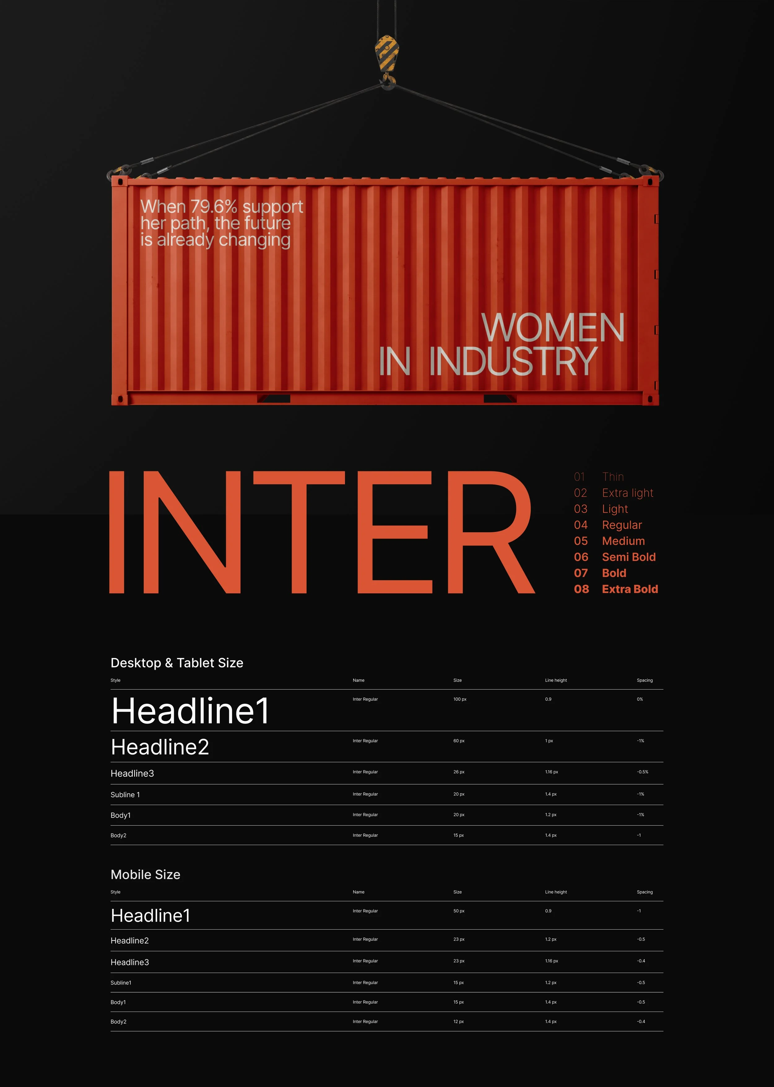
The visual identity was built at the intersection of industrial aesthetics and modern minimal design. The goal was to create a recognizable style that could reflect the world of factories, production, engineering, and technical work, while still feeling contemporary, clean, and accessible.
The design language was inspired by industrial documentation, technical grids, tables, schemes, factory materials, and structured working environments. This created a visual connection with the subject of the research and helped the project feel grounded in the real industrial context.
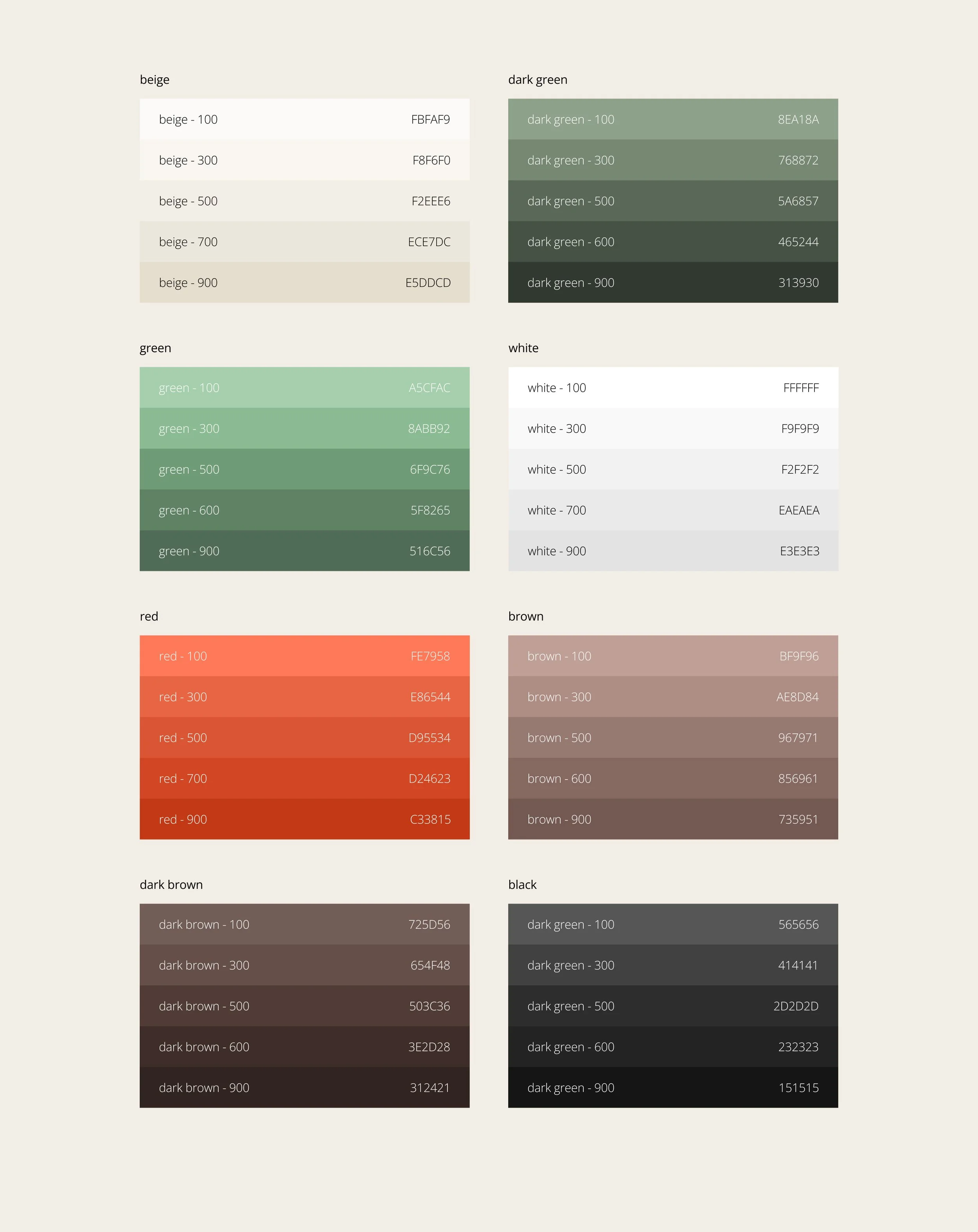
At the same time, the identity was not designed to look nostalgic or outdated. The system combines references to the past, present, and future of industry: strict layouts, modular grids, document-like structures, modern typography, bold visual accents, and a clean digital presentation style.
This balance helped the project communicate both seriousness and relevance. It felt connected to the industrial world, but not trapped in old visual clichés.
Material & Emotional Layer
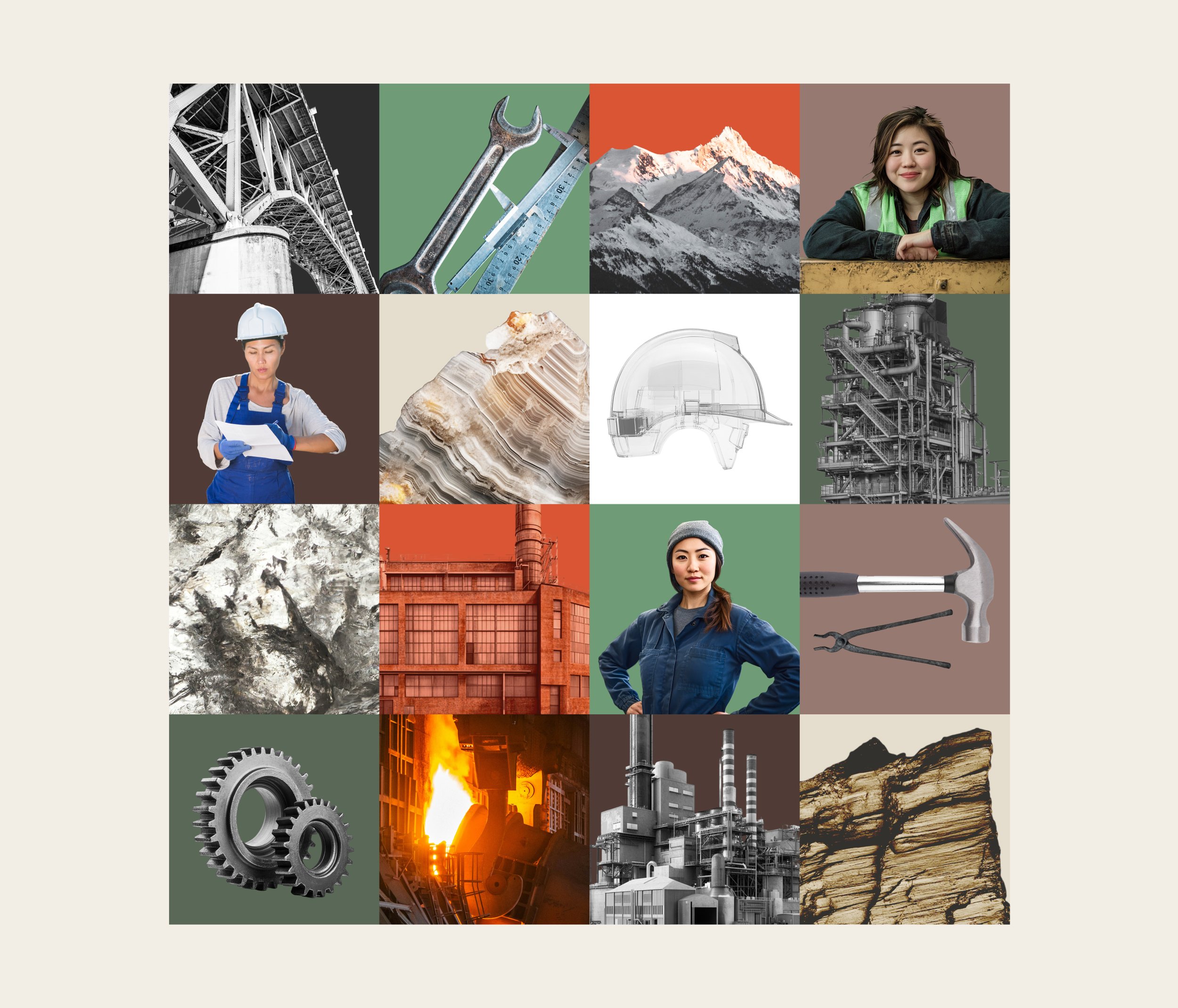
To make the project more tactile and emotionally engaging, the visual system included textures and material references associated with industrial work: stone, metal, concrete, production surfaces, raw materials, and technical environments.
These textures helped create a physical sense of industry and made the digital experience feel more connected to real workplaces. They added depth and atmosphere without making the design too heavy or decorative.
At the same time, bright images of people, tools, hands, equipment, and working environments were used to bring more emotion into the project. This helped balance the analytical nature of the research with a human perspective.
The result was a visual system where data, materials, people, and industry exist together making the project feel both factual and alive.
Editorial & Presentation System
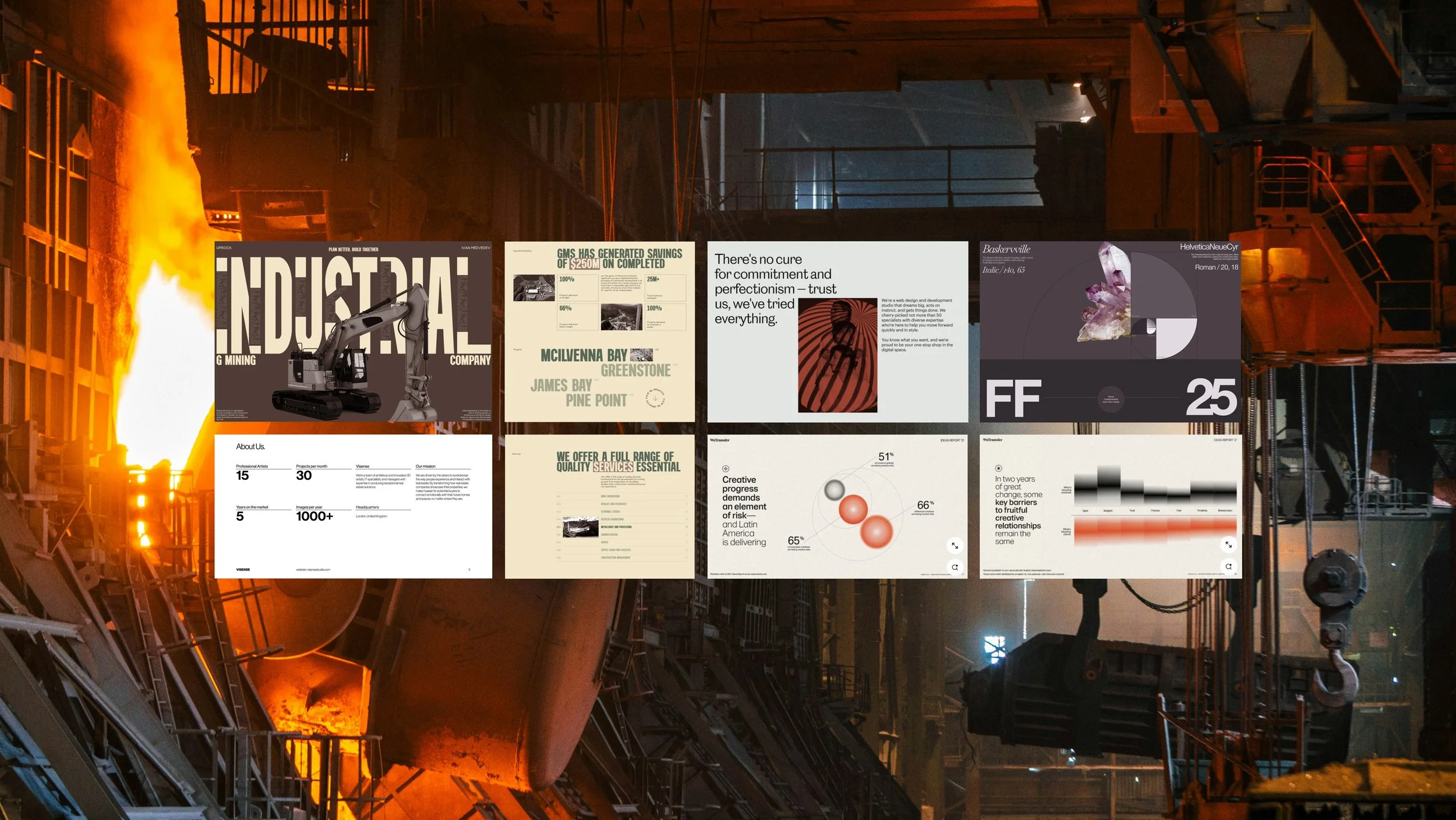
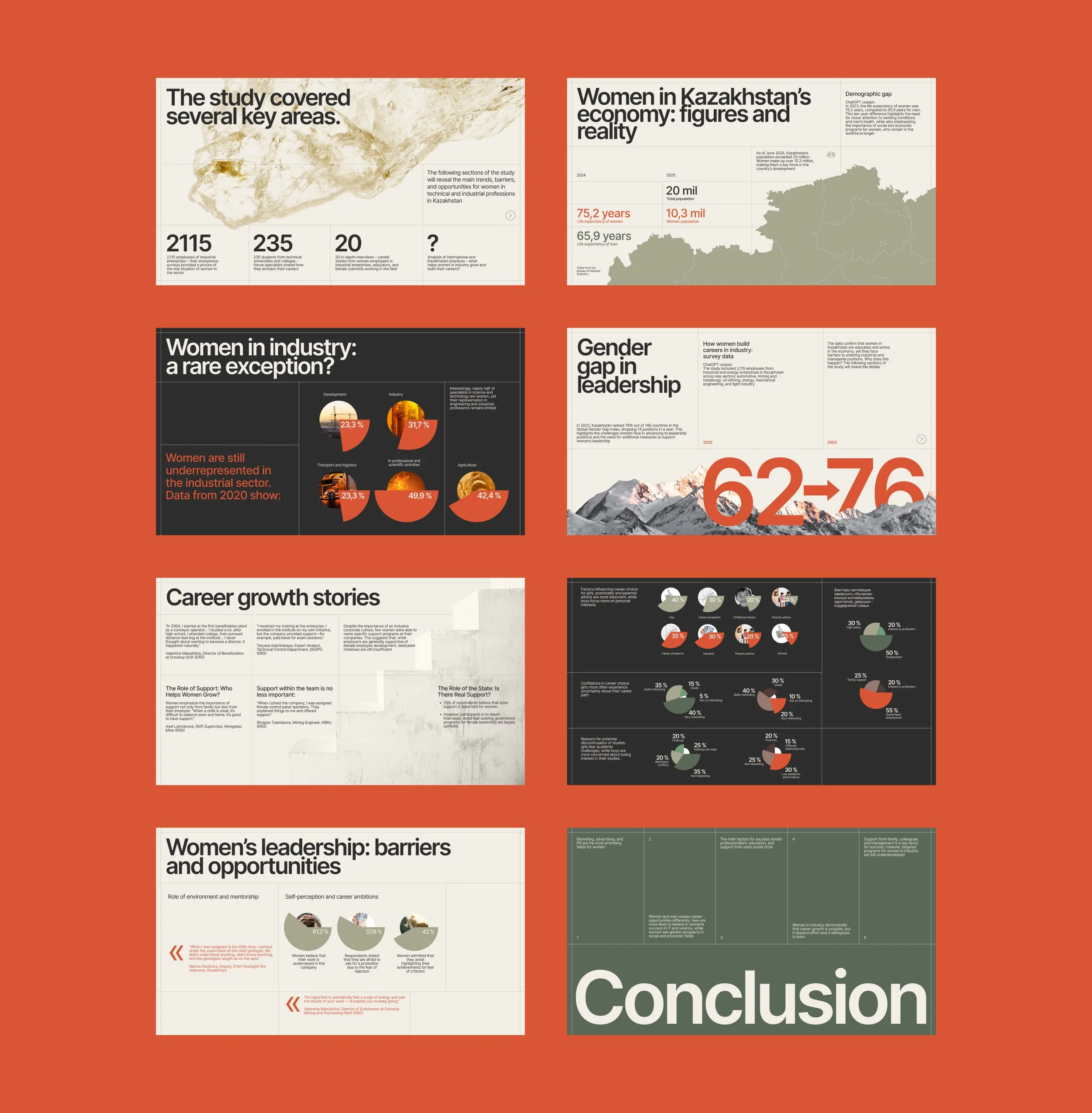
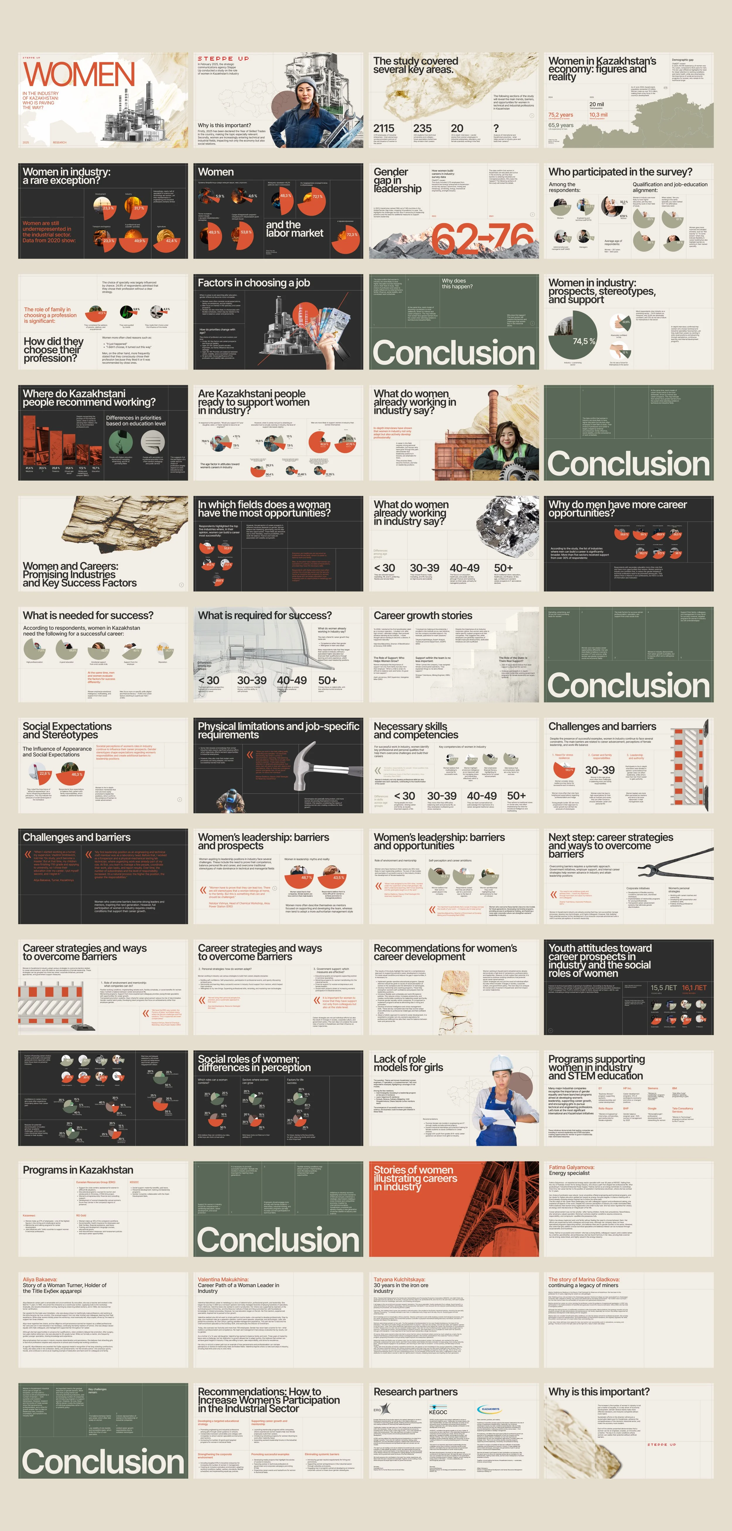
The research was transformed into a large presentation of more than 50 slides. This format became one of the main tools for public communication, expert discussions, and conference presentations.
The presentation system combined research findings, statistics, infographics, interview fragments, key messages, and visual storytelling. Each slide was designed as part of a larger narrative, with clear hierarchy and rhythm between dense analytical content and more emotional story-driven sections.
A major challenge was to keep the presentation visually strong while preserving readability. The design had to work for live presentations, large screens, conference environments, and later online viewing.
The final presentation helped make the research easier to present and discuss. Audiences responded positively to the clarity of the data, the visual style, and the way complex findings were made easier to perceive.
Public Presentations & Conferences
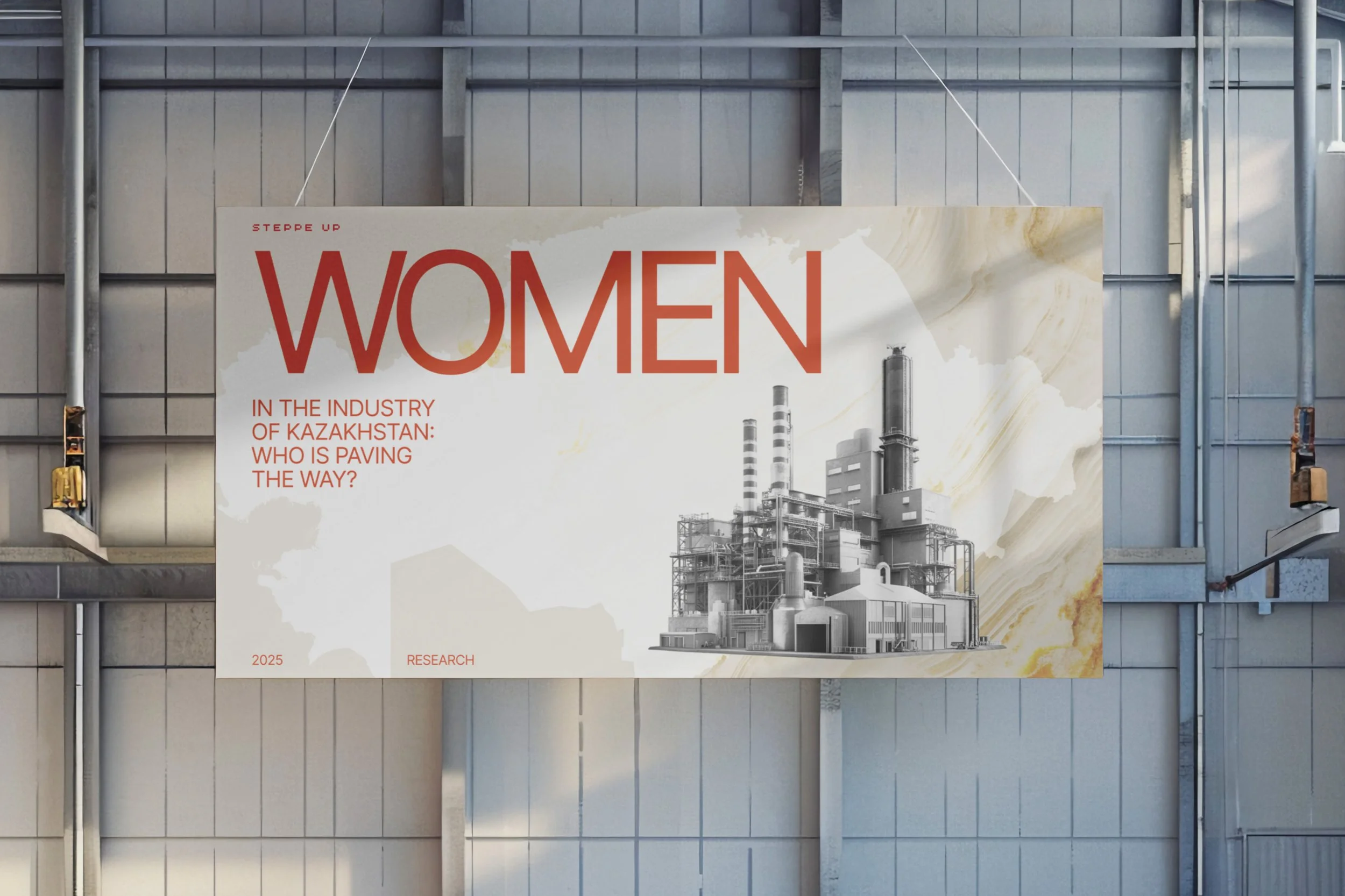
The project was presented at industrial conferences and public events, where it became a tool for discussing women’s role in technical and industrial fields. The visual system helped bring attention to issues that are often hidden behind formal reports or internal corporate conversations.
The presentation format allowed the research to speak to different audiences: industrial companies, experts, managers, students, journalists, and public stakeholders. The design made the data easier to understand during live presentations and helped keep the audience engaged throughout a complex topic.
The project showed how research, design, and communication can work together to raise awareness around social and professional issues inside industrial sectors.
Website & Online Experience
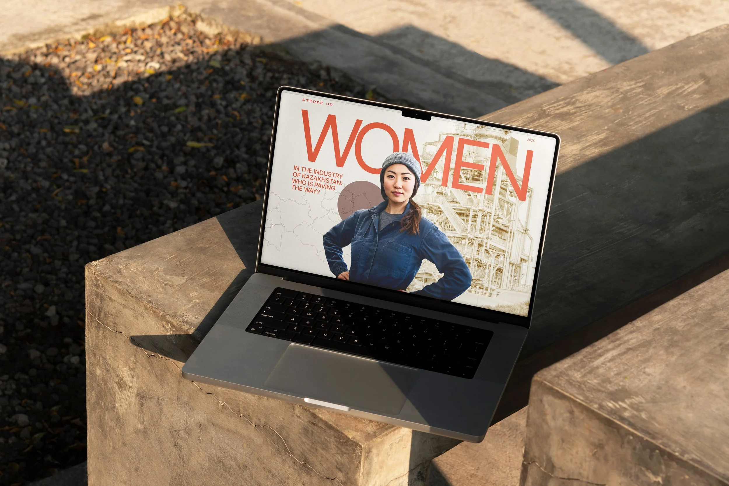
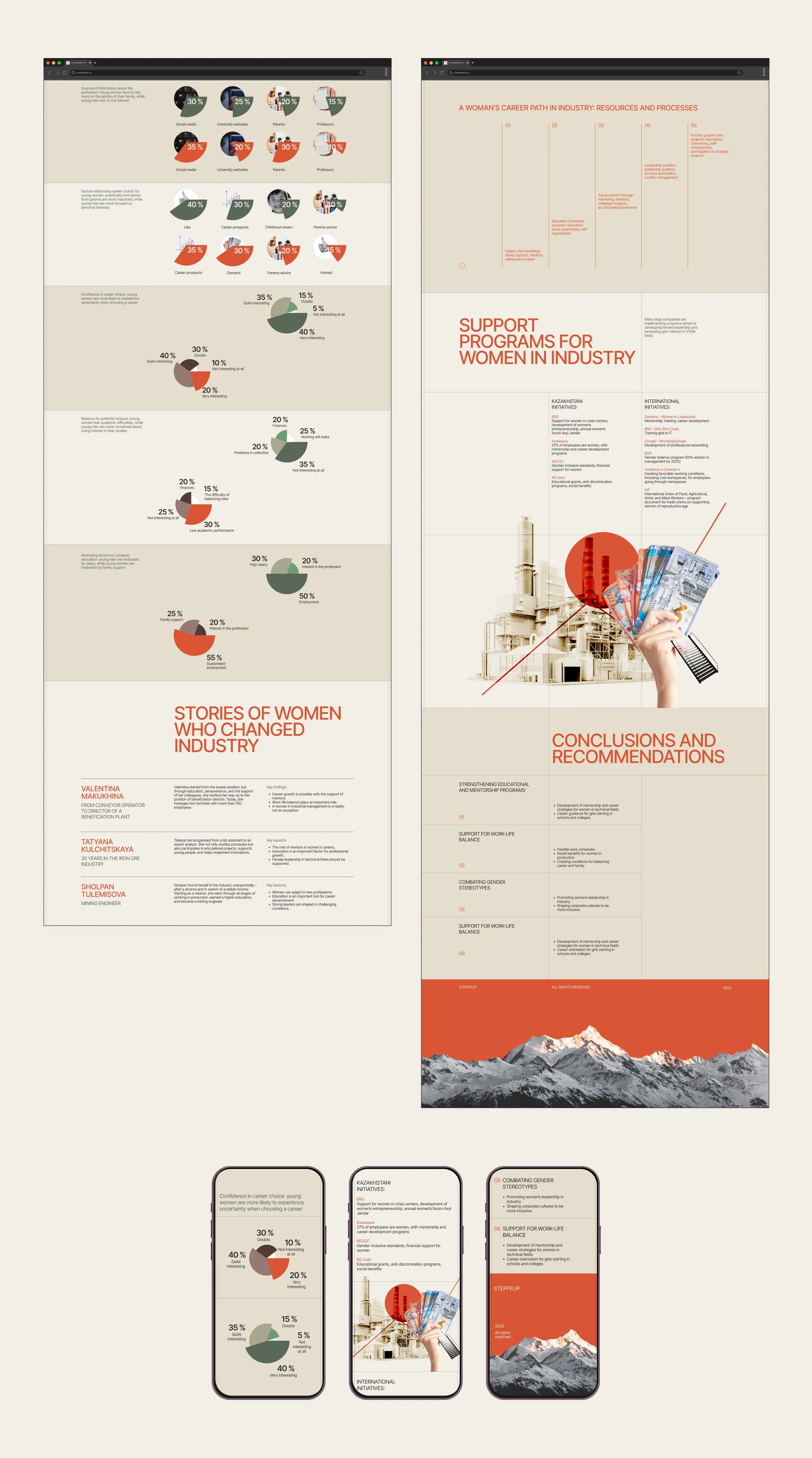
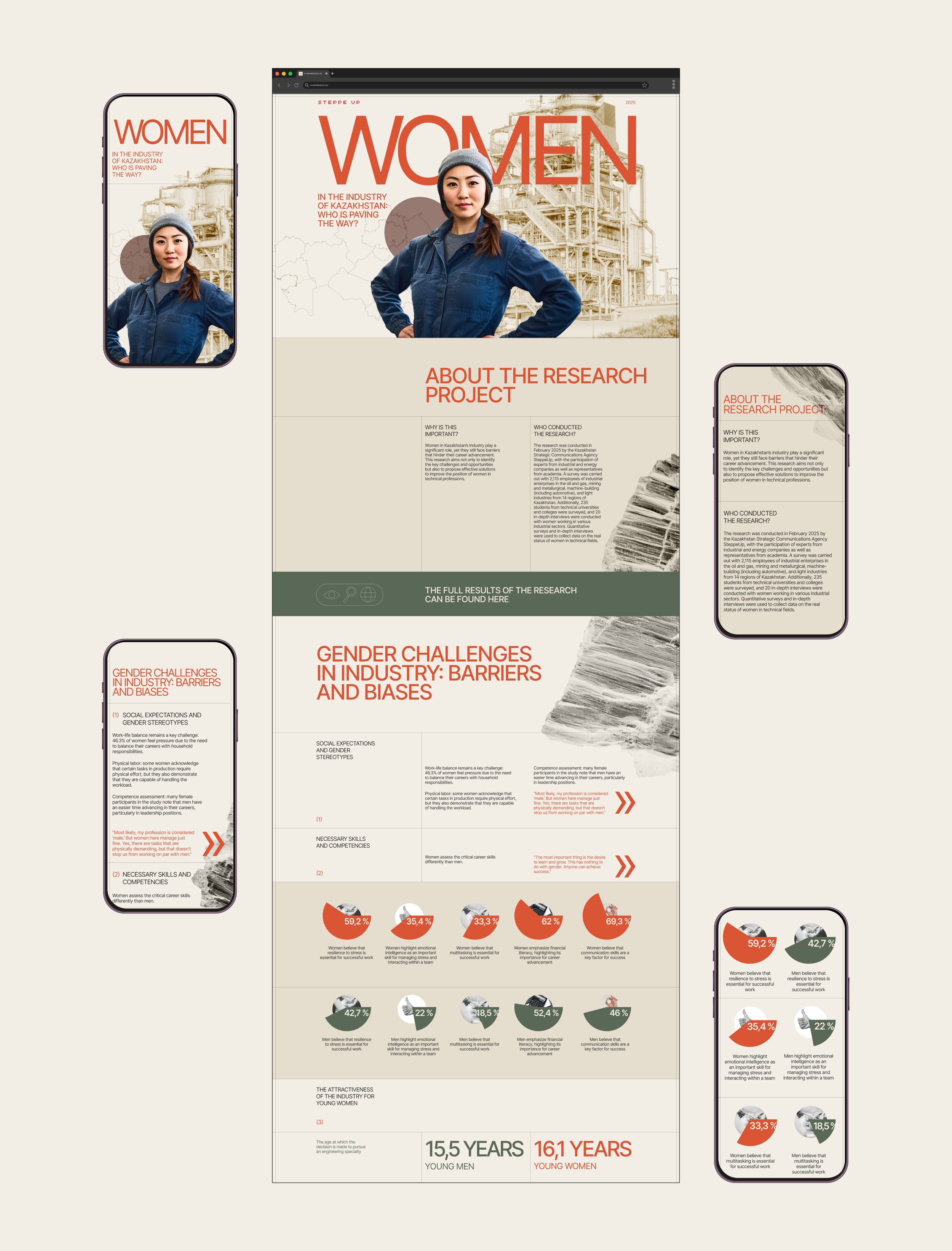
To bring the project online, I created a website that presented the key research findings in a shorter and more accessible format. The website introduced the project, explained its purpose, highlighted the most important data, and provided access to the full presentation online.
The online version had a different communication task than the presentation. It needed to work for people discovering the project through media, social networks, search, or public links. This required a more compact structure, clear navigation, strong visual entry points, and a faster way to understand the key message.
The website helped extend the life of the project beyond conferences. It made the research available to a wider audience and allowed the campaign to reach people who would not attend industry events in person.
Media & Public Response
After moving online, the project became easier to share, reference, and discuss in media and public communication. The website and visual materials helped present the research in a more accessible format for journalists, younger audiences, students, and people outside the industrial sector.
The project found a stronger connection with a younger audience because it did not look like a traditional institutional report. The combination of research, modern visual language, data design, and human stories made the topic easier to approach and more relevant to people interested in gender equality, careers, education, and the future of work.
This helped the campaign move beyond a professional industrial audience and become part of a broader public conversation.
Outcome
Women in Industry became more than a research presentation. It turned into a complete communication system around a socially important topic: women’s visibility, experience, and opportunities in industrial sectors.
The project helped translate large-scale research into a clear and memorable format. Data became easier to read, interviews became part of the narrative, and the visual identity gave the campaign a recognizable voice.
The final system included a large presentation, data visualization framework, infographics, editorial layouts, visual identity, website, and online access to the research materials. Together, these elements helped the project reach different audiences and support public discussion around women in industry.
Social Value
The project helped make the topic of women in industry more visible and easier to discuss. Instead of presenting the issue only through formal research language, the campaign used design to connect data with real people, professional experiences, and broader social questions.
For industrial companies and experts, the project offered a structured view of the problem. For students and younger audiences, it made the topic more accessible and relevant. For media and public communication, it provided a strong visual language and clear data points that could be shared and referenced.
This is where the value of design became especially important: it helped research move from internal analysis to public conversation.
Conclusion
Women in Industry demonstrates how design can turn complex research into a meaningful public communication product. The project combined quantitative data, interviews, data visualization, editorial logic, and visual identity to create a clear and engaging experience around a serious social and economic topic.
The design system was built to make information easier to understand without simplifying the importance of the issue. Industrial aesthetics, material textures, structured grids, modern typography, emotional imagery, and accessible infographics worked together to create a project that felt analytical, human, and memorable.
By transforming research into a presentation, website, and visual campaign, the project helped bring attention to the role of women in industry and made the findings available to wider audiences. It became an example of how UX thinking, data design, and visual communication can be used not only for digital products, but also for research, social impact, media, and public awareness.