


Nama
Overview
Nama is a contemporary Asian restaurant positioned around refined dining, clean flavours, and premium-quality ingredients. Its menu brings together sushi, sashimi, hand rolls, and a curated drinks selection within a modern and accessible restaurant experience.
I developed a cohesive visual identity that translates this positioning across the brand’s key customer touchpoints. The system was designed to differentiate Nama in a competitive hospitality market, communicate the quality of its offering, and maintain a consistent brand experience across menus, packaging, print materials, and the restaurant environment.
Restaurants
Industry
Brand Identity
Visual Communications
Print Design
Packaging Design
Services
Client
Pinskiy & Novikov
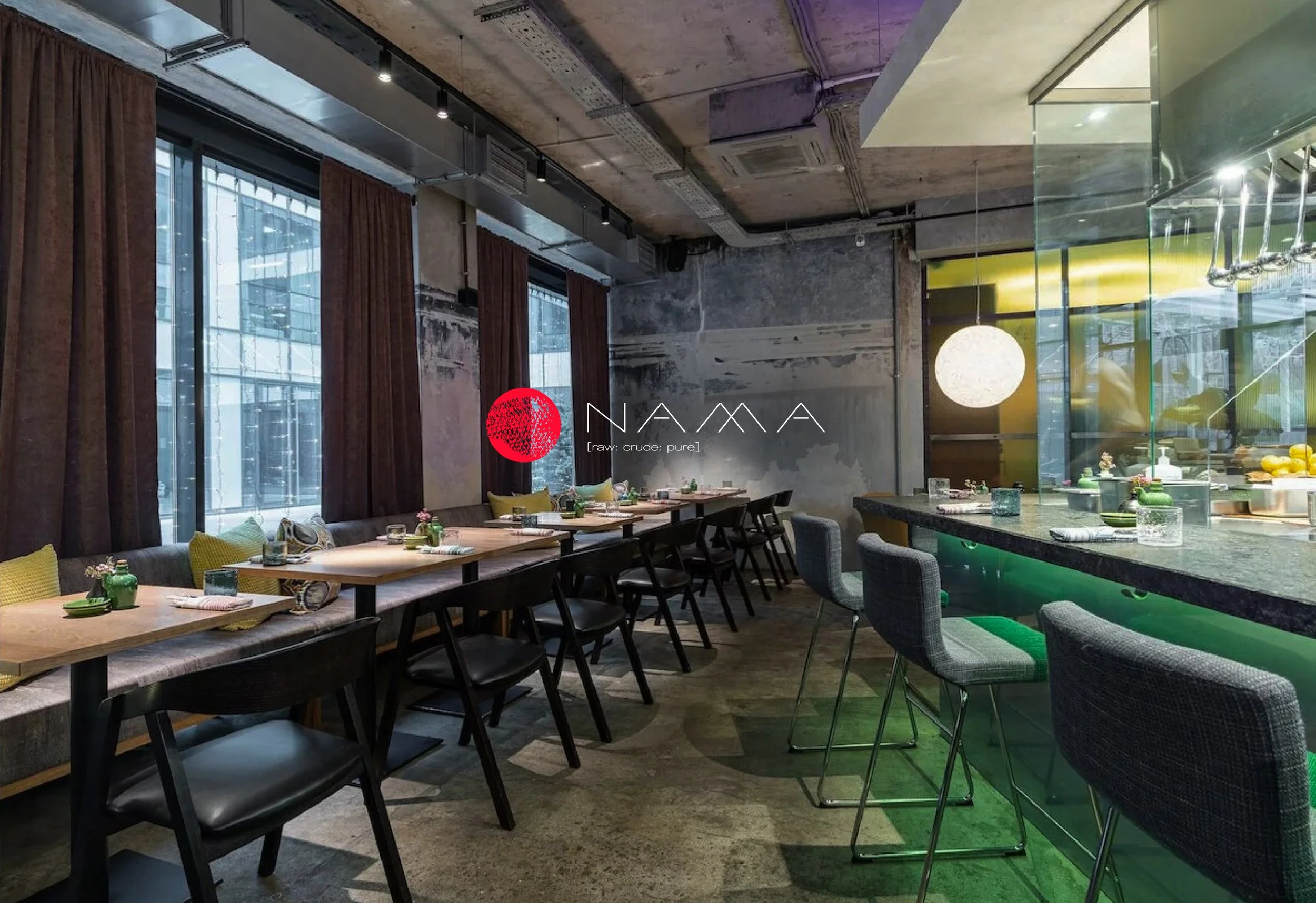

Business Context
Nama had already entered the development stage with an existing logo, but without a defined visual system around it. There were no brand guidelines, visual principles, tone of communication, or clear expectations for how the restaurant should appear across its physical and digital touchpoints.
For a restaurant positioned around contemporary Asian dining, clean presentation, and premium-quality ingredients, this created a business risk: the brand could easily become visually inconsistent across menus, packaging, print materials, signage, and event communications.
Objective
My task was to transform a single existing logo into a flexible and recognizable identity system that could support the restaurant’s day-to-day communication and future growth.
The goal was not simply to design individual materials, but to define a visual direction that would help the restaurant communicate its positioning, stand out in a competitive hospitality market, and create a consistent impression across every customer interaction.


Research & Direction
I began by analyzing restaurants with similar positioning, focusing on how contemporary Asian dining brands communicate quality, freshness, clarity, and atmosphere through visual language.
This research helped identify several possible directions and define the criteria for decision-making: the identity had to feel modern, clean, expressive, and practical enough to work across a wide range of formats — from menus and packaging to signage, social assets, and event materials.
Instead of relying on subjective taste, each direction was evaluated through its ability to support the brand’s positioning and remain consistent across real customer touchpoints.
Design Principles
The visual system was built around four principles:
Clarity — the design needed to support fast reading and easy navigation, especially across menus and printed materials.
Premium simplicity — the visual language had to communicate quality without becoming overly decorative or visually heavy.
Flexibility — the system had to work across different formats, from small packaging details to large printed and environmental applications.
Recognition — the brand needed distinctive graphic accents that could make the restaurant more memorable without overpowering the food and dining experience.


Visual System
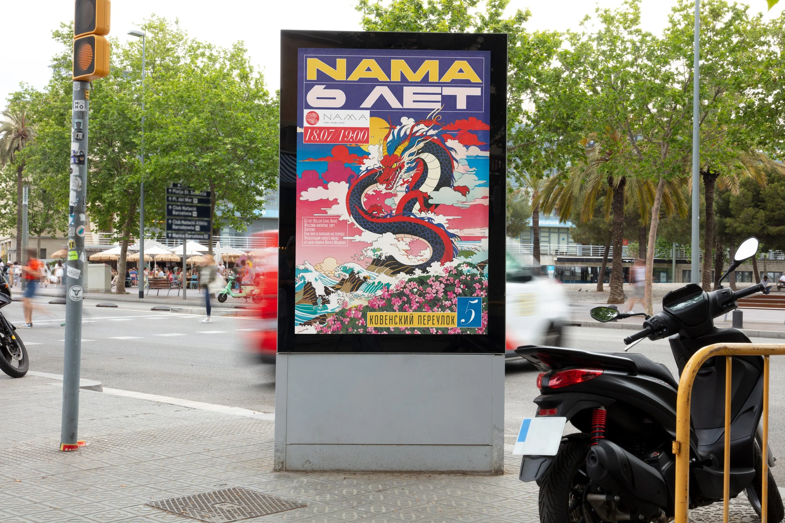
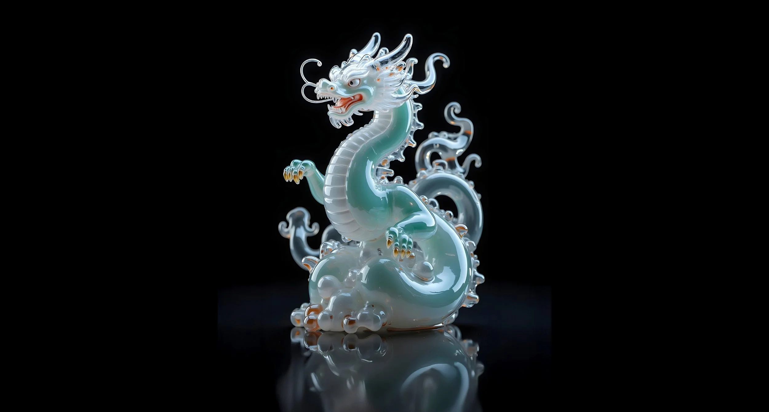
Based on the selected direction, I developed a cohesive visual language for the restaurant’s communication materials. The system combined clean typography, bold accents, structured layouts, and a restrained but expressive graphic approach.
This allowed the brand to remain consistent across different applications while still having enough flexibility for seasonal updates, events, packaging variations, and new printed materials.
Decision-Making
Because the project started without a clear visual reference, the process required several rounds of exploration and refinement. I developed multiple design directions, tested how they worked across real materials, and adjusted the system based on feedback from the restaurant’s leadership and internal team.
This iterative process helped move the project from uncertainty to a clear and confident visual direction. Each decision was shaped not only by aesthetics, but also by how well the design supported the restaurant’s positioning, operations, and customer-facing communication.




Outcome
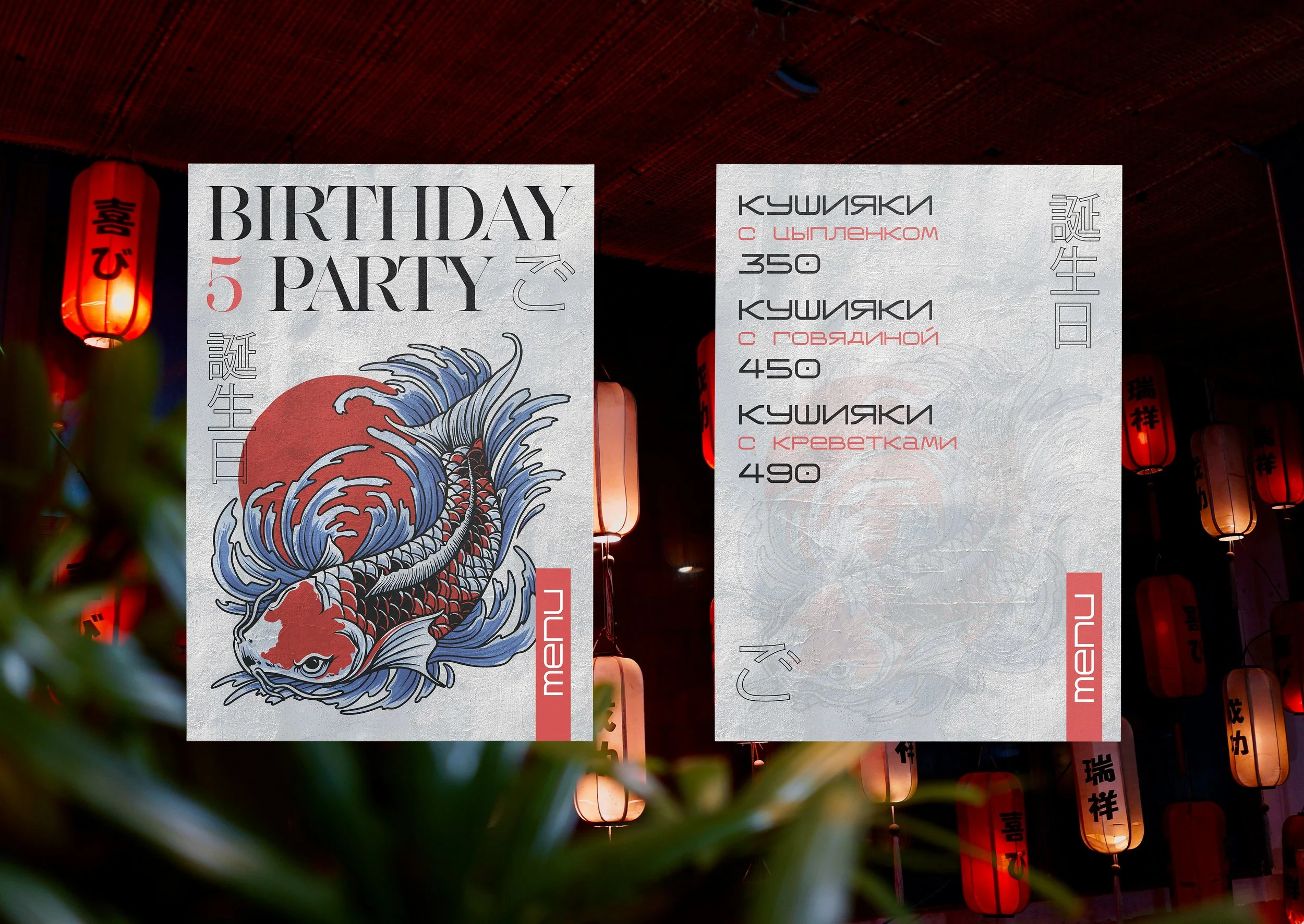
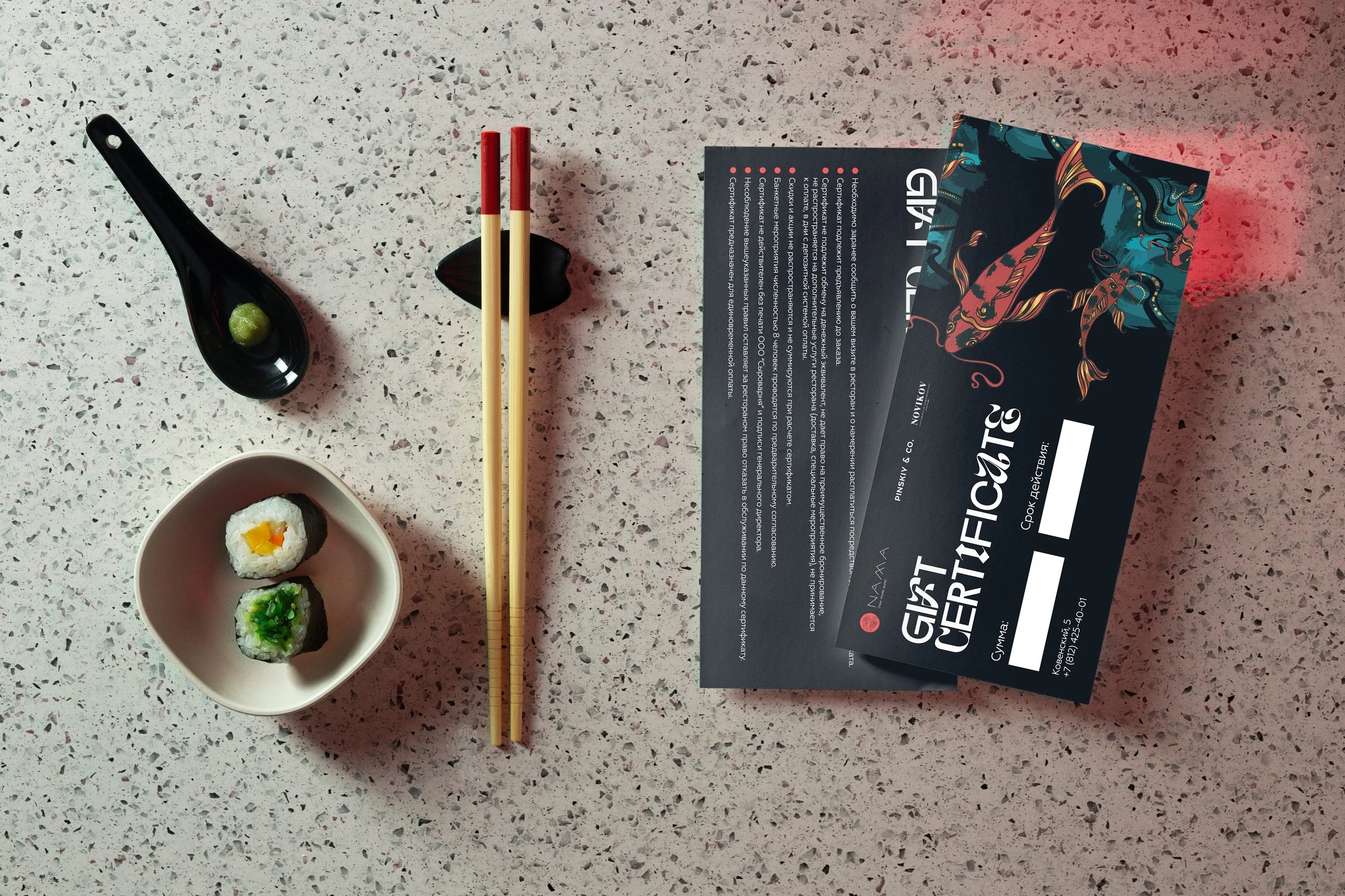
The final identity gave Nama a consistent and practical visual framework for everyday communication. It helped connect separate materials — menus, packaging, print assets, signage, and event communications — into one recognizable brand experience.
The result is a flexible visual system that supports the restaurant’s premium positioning, strengthens recognition across physical touchpoints, and gives the business a reliable foundation for future brand development.
Business Value
The new visual system helped Nama turn an undefined starting point into a consistent and recognizable brand experience. It gave the restaurant a practical framework for menus, packaging, signage, events, and future communication materials.
As a result, the brand became easier to manage, more distinctive in the hospitality market, and better aligned with its positioning around contemporary Asian dining and premium-quality ingredients.