

Instant Payment System
Overview
Instant Payment System is a fintech infrastructure product for instant transfers and payments between banks, businesses, and users. The system supports multiple payment scenarios, including transfers by phone number, QR payments, invoices, and account-based transactions.
We worked on the project from its launch stage, creating the brand identity, website, product communication system, presentations, and other materials needed to explain a complex payment infrastructure to banks, partners, stakeholders, and end users.
The main challenge was to make a technically complex product feel clear, reliable, and trustworthy. Our work helped turn IPS into a recognizable fintech brand with a communication system that could support product launch, partner onboarding, business development, and future growth.
Client
Aitu PS
Fintech
Industry
Product Design
Brand Identity
Design Systems
UX/UI Design
Visual Communications
Presentation Design
Print Design
Services
Product scale
The product grew into a national-scale fintech infrastructure with strong operational metrics:
4.9M+ transactions processed
603B+ ₸ total transaction turnover
20B+ ₸ monthly turnover
0.3 sec average transaction processing time
99.8% successful transaction rate
100% uptime
1000 TPS processing capacity
11 banks + 1 payment organization connected
Unsuccessful C2C transactions reduced from 5% to 0.49%
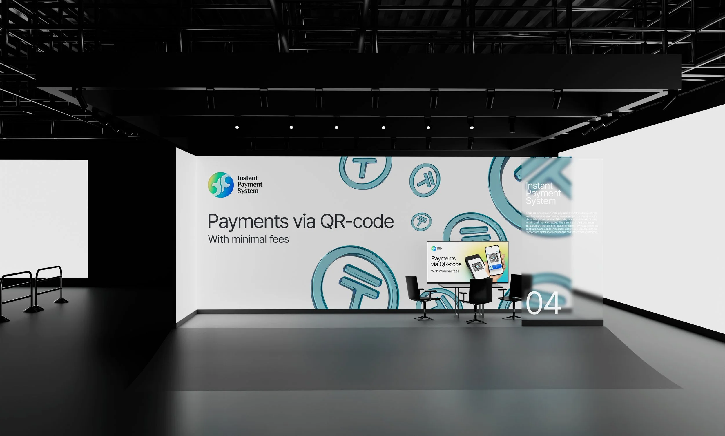
Business Context
The project started from scratch: there was no established brand identity, website, visual language, or communication framework. At the same time, IPS was not a simple consumer-facing service, but a complex payment infrastructure product involving banks, businesses, product teams, regulators, and end users.
This created a business challenge: the product had to communicate speed, security, reliability, and technological maturity while remaining understandable for different audiences. Banks and partners needed to see the value of integration, stakeholders needed a clear product narrative, and users needed to understand payment scenarios without technical complexity.
Objective
Our task was to build a complete visual and communication system for a fintech product launched from zero. This included brand identity, website structure, product explanation, presentation materials, diagrams, and supporting assets for launch, partner communication, and stakeholder presentations.
The goal was not only to create a recognizable visual style, but to make the product easier to explain, easier to present, and easier to scale across different business and product touchpoints.


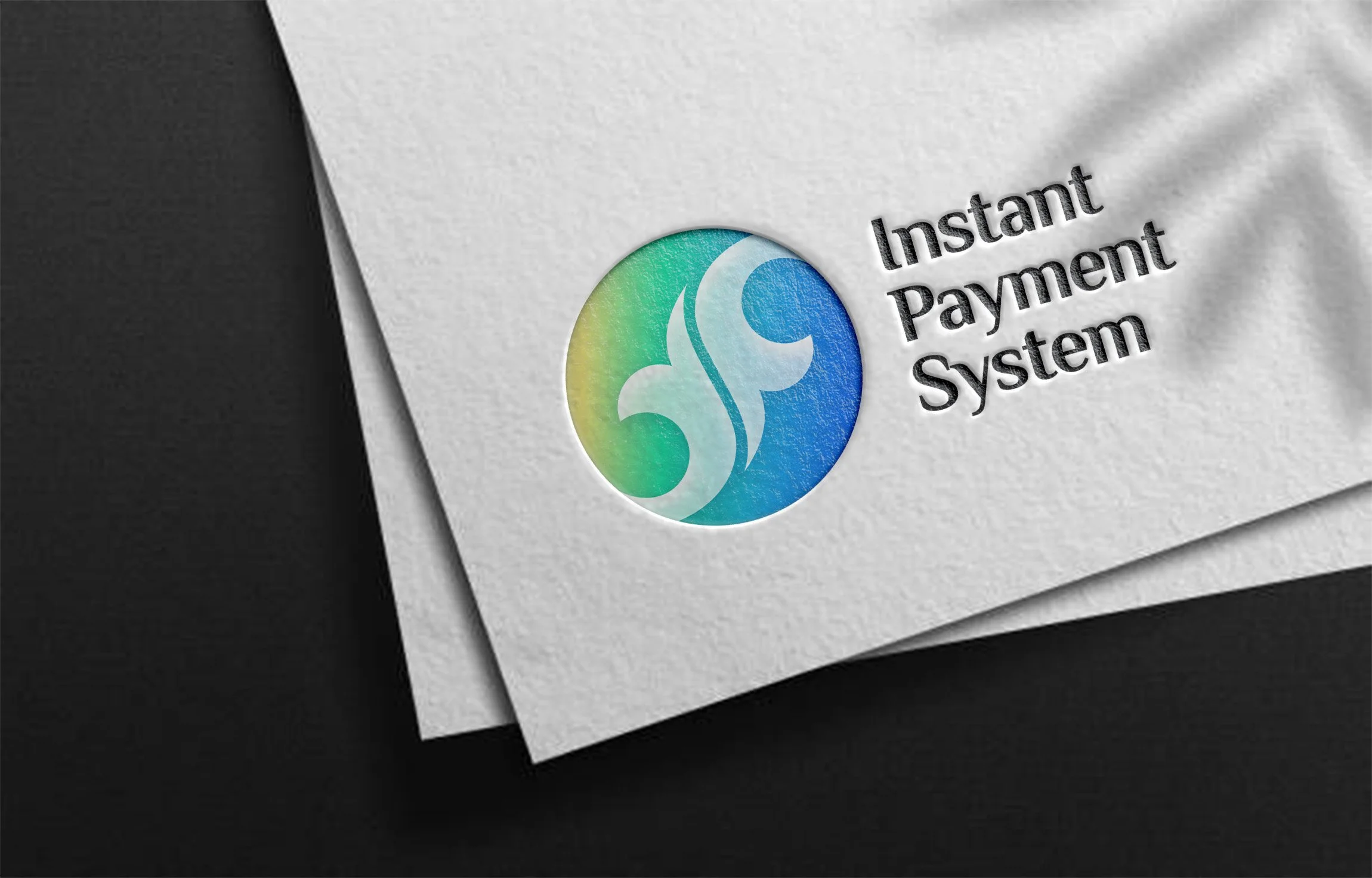
Logo meaning
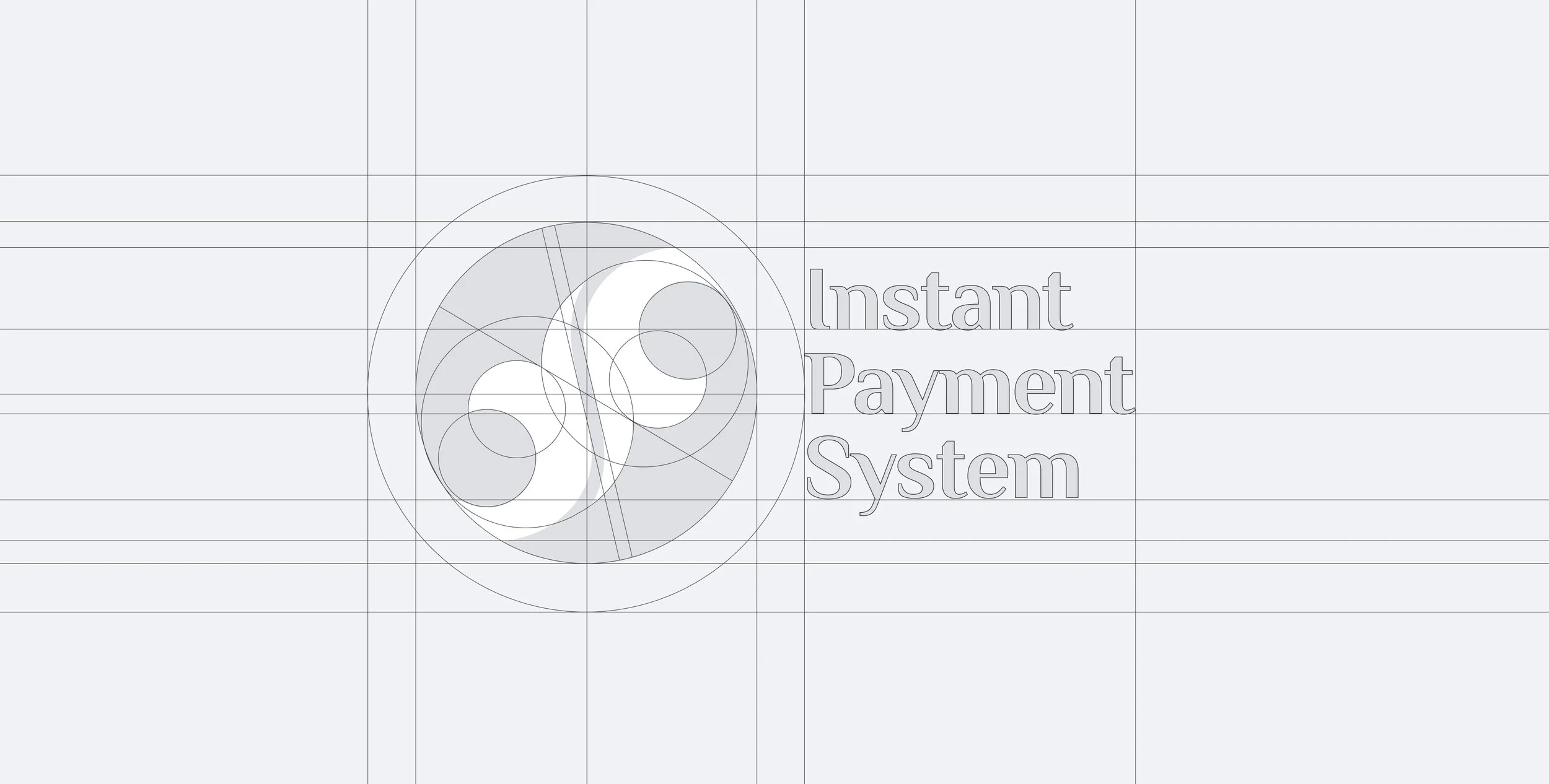
We selected a circular shape and colors merging the globe and a coin to symbolize both monetary value and global reach—the round shape evokes trust, unity, and continuity, while the coin motif immediately conveys financial transactions; integrating the Earth reinforces seamless connectivity in instant payments. The main colors are blue, green and yellow.
Blue symbolizes reliability, stability, and professionalism: common in financial, tech, and corporate branding. It also reflects a connection to Aitu’s parent ecosystem. In Kazakh (көк), blue is linked to the boundless sky, wisdom, purity of spirit, and loyalty. Green in a financial context represents growth, money, and success. In Kazakh (жасыл), green traditionally signifies nature, renewal, vitality, and well‑being. Yellow embodies energy, positivity, and wealth. In design, it is often associated with warmth and accessibility. In Kazakh (күн), yellow is connected to the sun, warmth, and prosperity: it represents grandeur and success, especially evoking gold (алтын).
“Kazmoyin” pattern means Harmony & Movement – the smooth lines evoke energy flows and continuous motion. Two symmetrical elements symbolyzes two mutually directed money transfers.
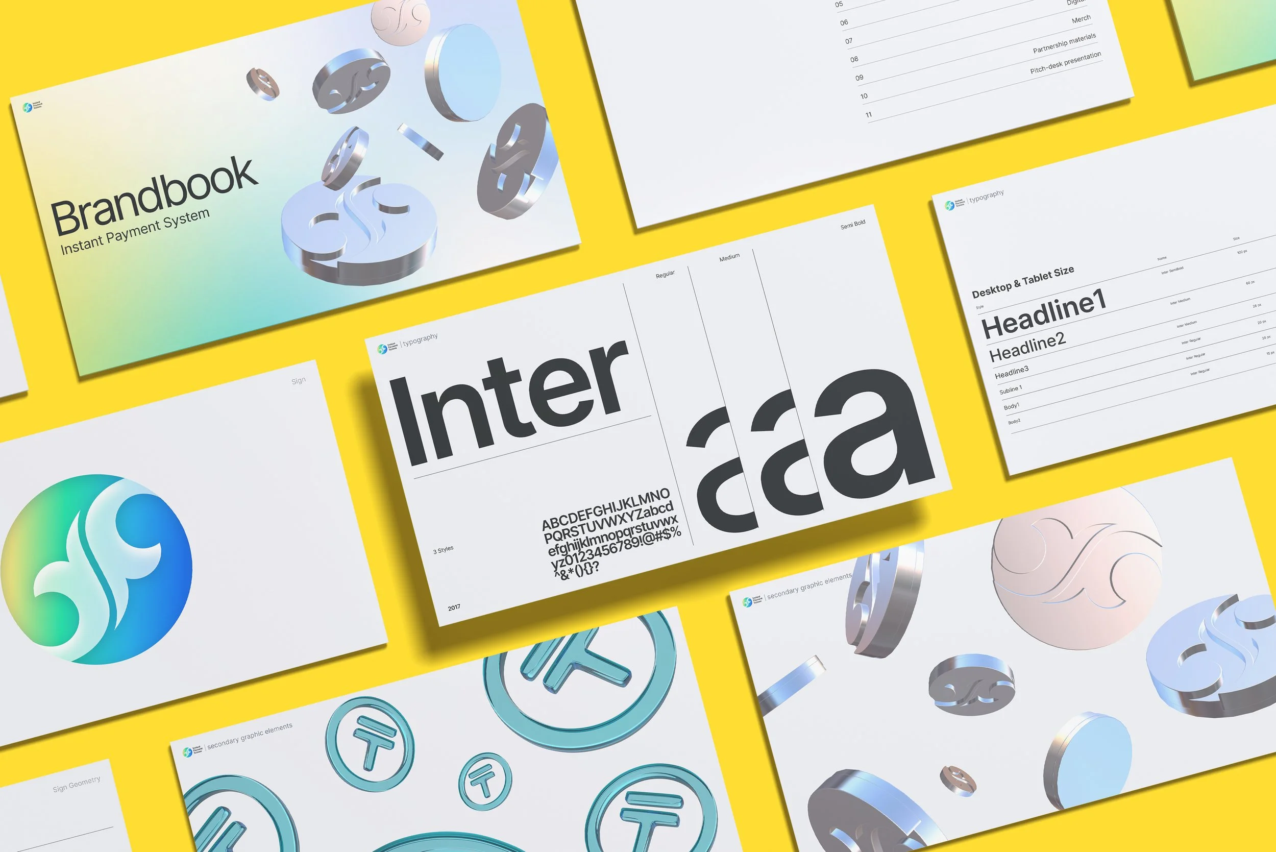
The typeface used for the text portion of the logo echoes the contours and letterforms of the “Kazmoyin” symbol and pattern that form its foundation. In addition to supporting Russian and English, the font includes complete coverage of Kazakh language characters, eliminating any potential display issues.
Research & Validation
As part of the identity development, we used a three-stage validation process to make the logo decision more structured and less dependent on subjective preferences. The goal was to choose a visual direction that could work not only as a brand mark, but also as part of a scalable fintech product system.
At the first stage, we tested several logo mark options and collected feedback to understand which symbol was perceived as the most clear, recognizable, and relevant to the product’s role in instant payments and financial infrastructure. Based on the results, we selected the strongest mark for further development.
To define the color direction, we analyzed the visual language of competing fintech and banking products. The goal was to create an identity that would stand out in the market while still feeling familiar and relevant to a national-scale service.
We wanted the color system to be close to national visual codes and communicate the idea of a people-oriented service — simple, accessible, and easy to use every day. At the same time, it was important not to make the identity feel traditional or archaic. IPS had to look modern, technological, and ready for large-scale digital use.
The final direction combined national color references with contemporary digital aesthetics: gradients, soft 3D elements, glass-like surfaces, and clean interface-friendly colors. This helped the brand communicate trust, accessibility, and innovation while remaining visually different from other payment and banking products.
This process helped turn the logo selection into an informed design decision, supported by feedback, product context, and practical application requirements.
Research & Product Direction
We began by analyzing the product logic, key payment scenarios, target audiences, and communication needs around IPS. The system had to work for several very different contexts: public website, banking presentations, partner onboarding, product diagrams, marketing materials, and internal stakeholder communication.
The main focus was to translate complex payment infrastructure into a clear product story. We worked with scenarios such as instant transfers, QR payments, invoices, payment confirmation, and bank-to-bank interactions to understand what needed to be explained visually and what should remain simple for the user.
Instead of treating the project as a branding task only, we approached it as a product communication system: every visual decision had to support understanding, trust, and business adoption.
Design principles
The visual and communication system was built around four principles:
Clarity — the product had to be understandable for banks, partners, stakeholders, and users without overloading them with technical details.
Trust — as a fintech infrastructure product, IPS needed to communicate reliability, security, and operational maturity.
Scalability — the system had to work across a wide range of materials, from website pages and presentations to diagrams, product screens, and marketing assets.
Product logic — visual decisions were based on real payment scenarios, user flows, and business communication needs rather than decorative design choices.
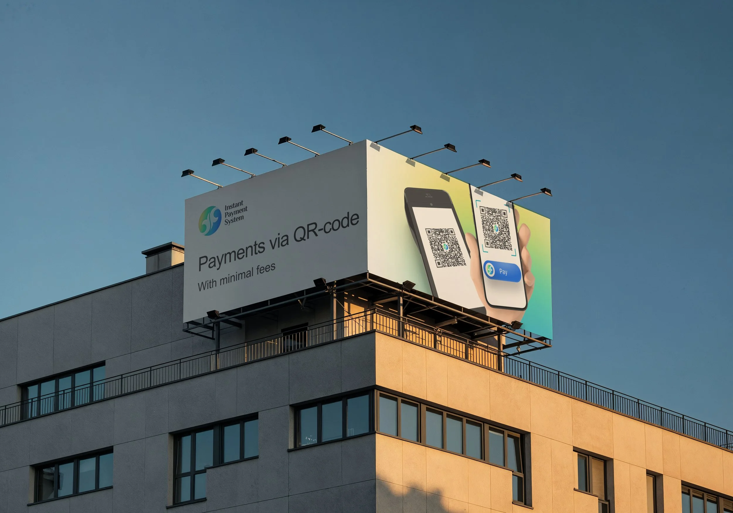

Visual System
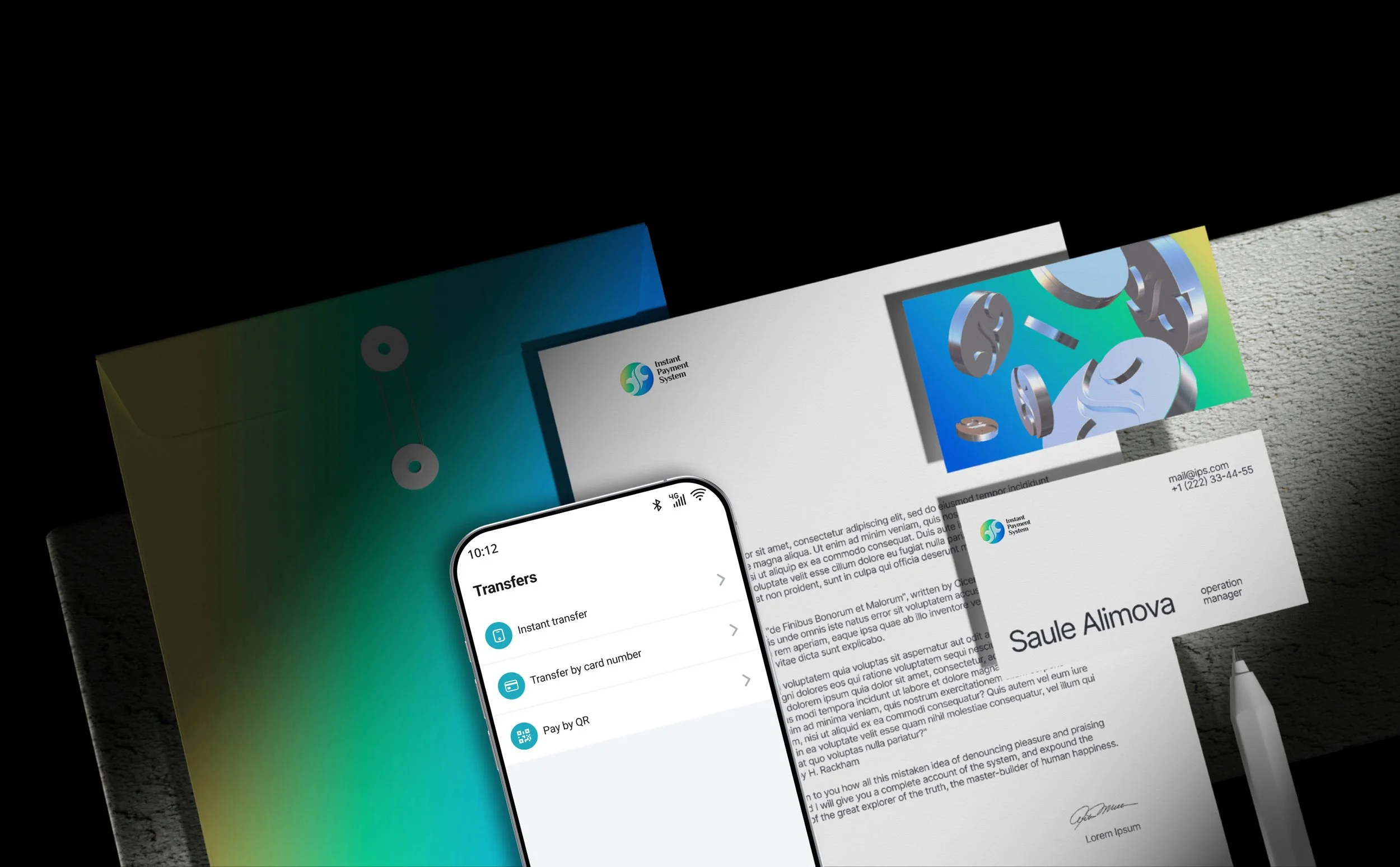
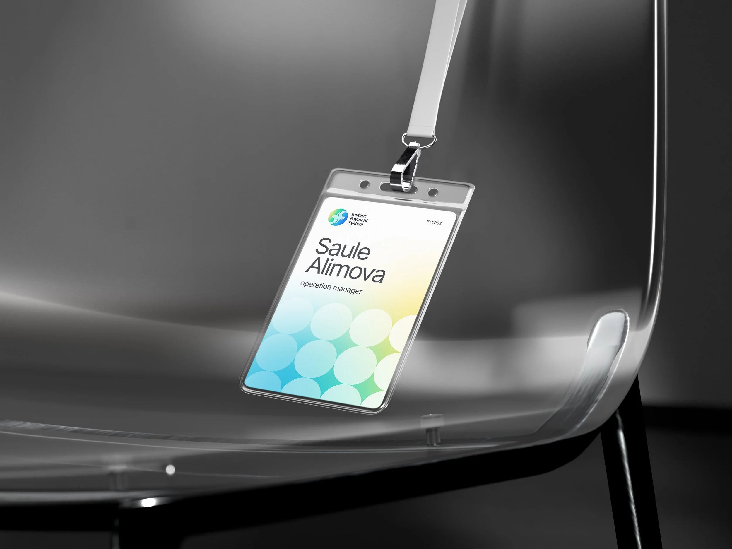
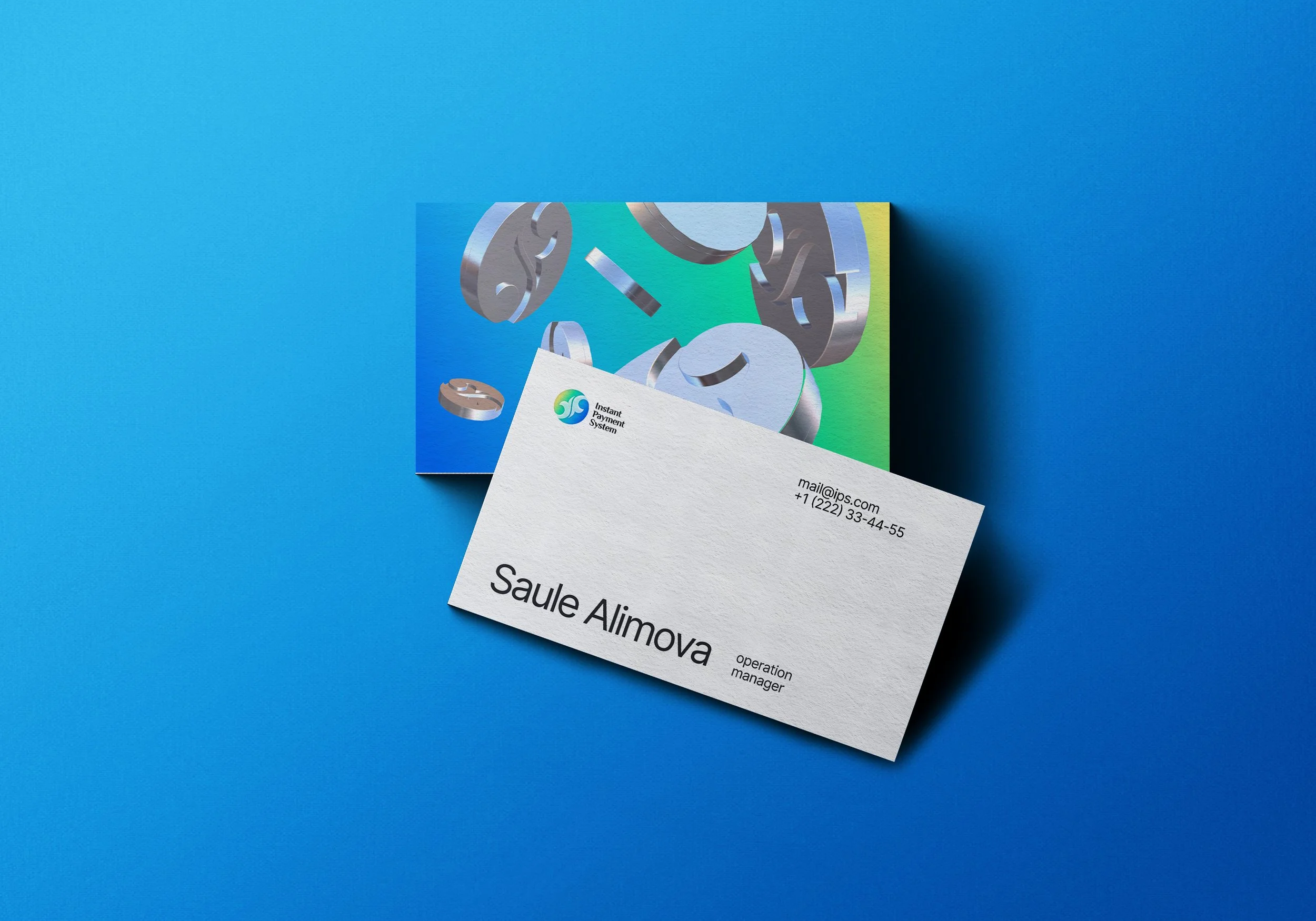
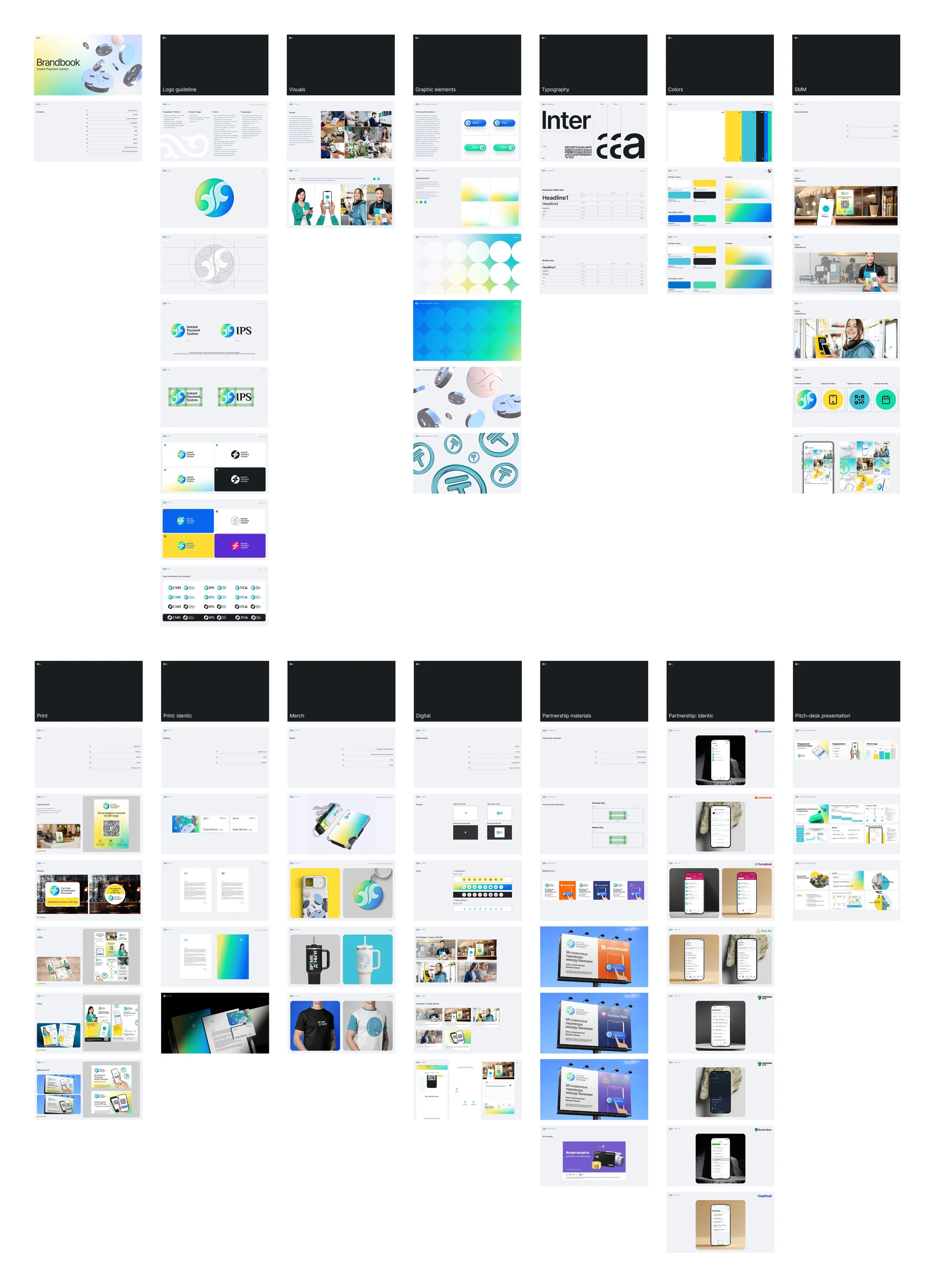
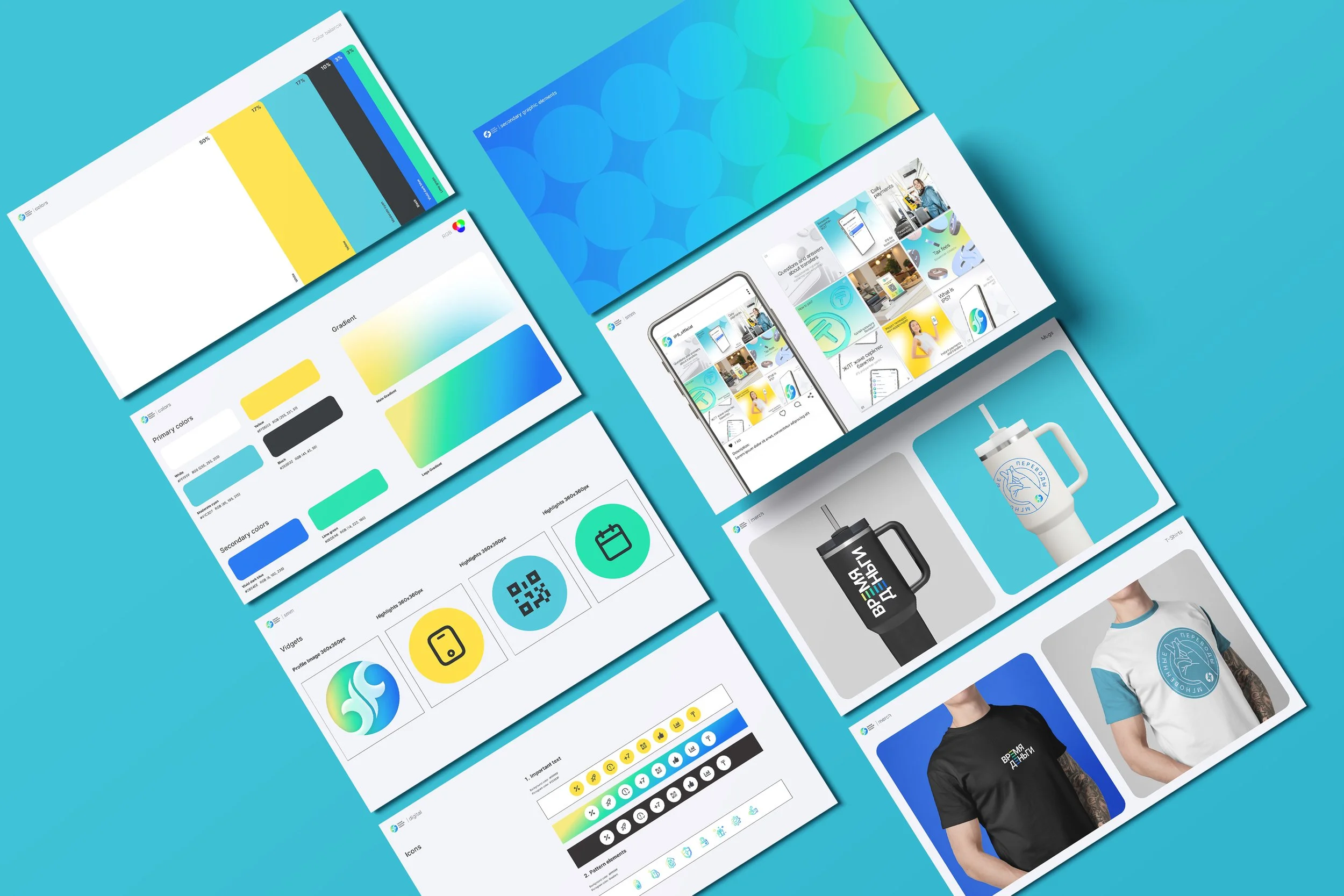
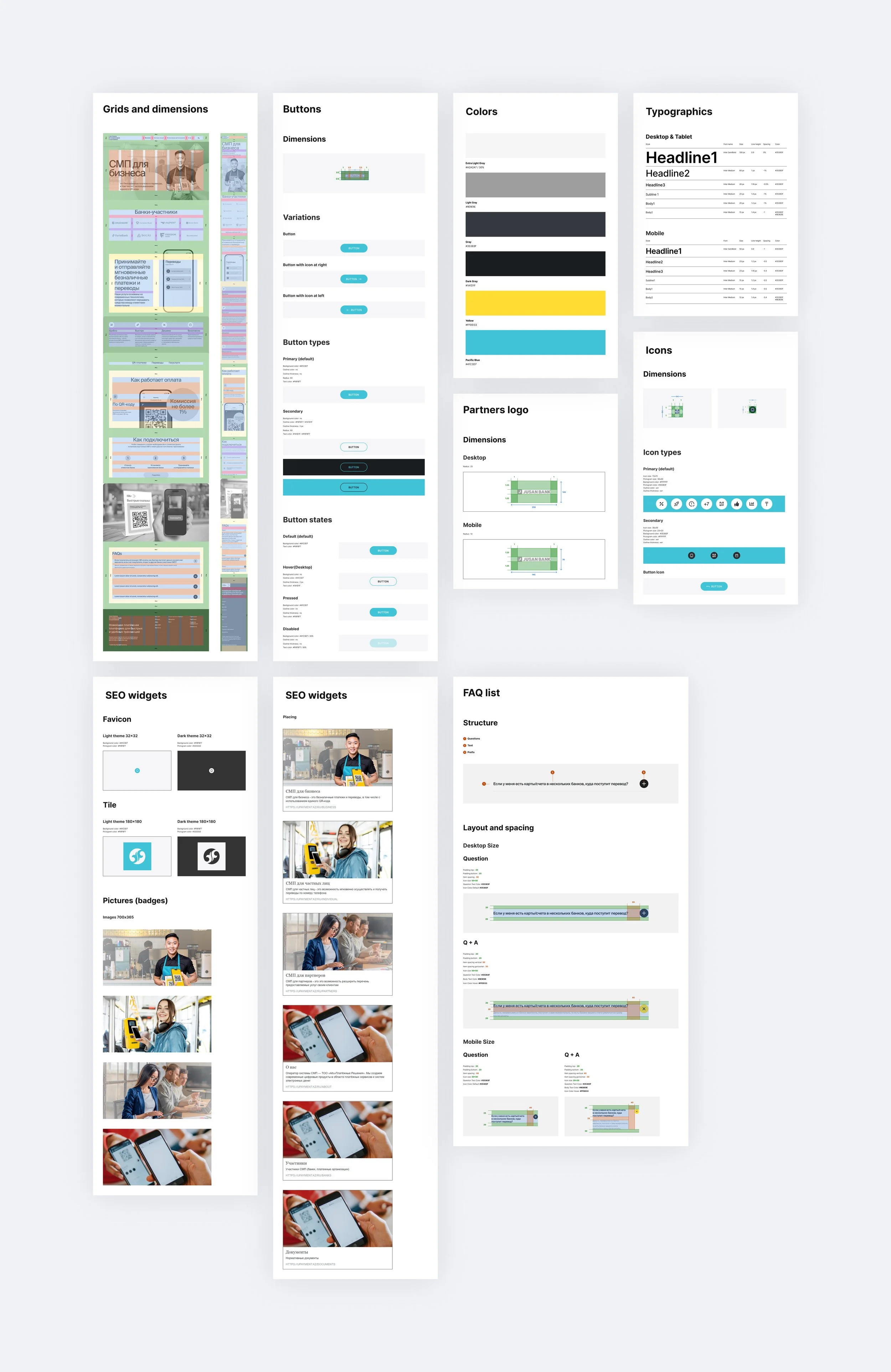
We developed the brand identity and visual language for IPS from scratch. The system combined a clean technological look, structured layouts, clear typography, and graphic elements that helped explain movement, connection, transaction flow, and infrastructure logic.
The visual system was designed to support different levels of communication: simple enough for public-facing materials, structured enough for partner and banking presentations, and flexible enough for future product updates.
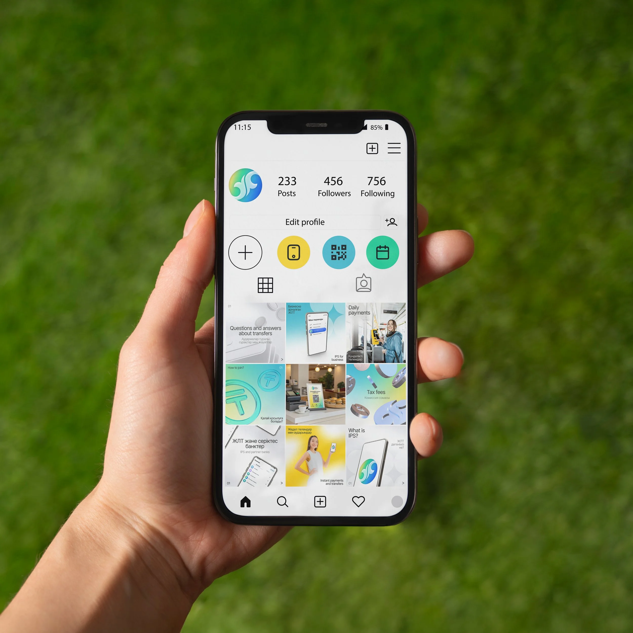
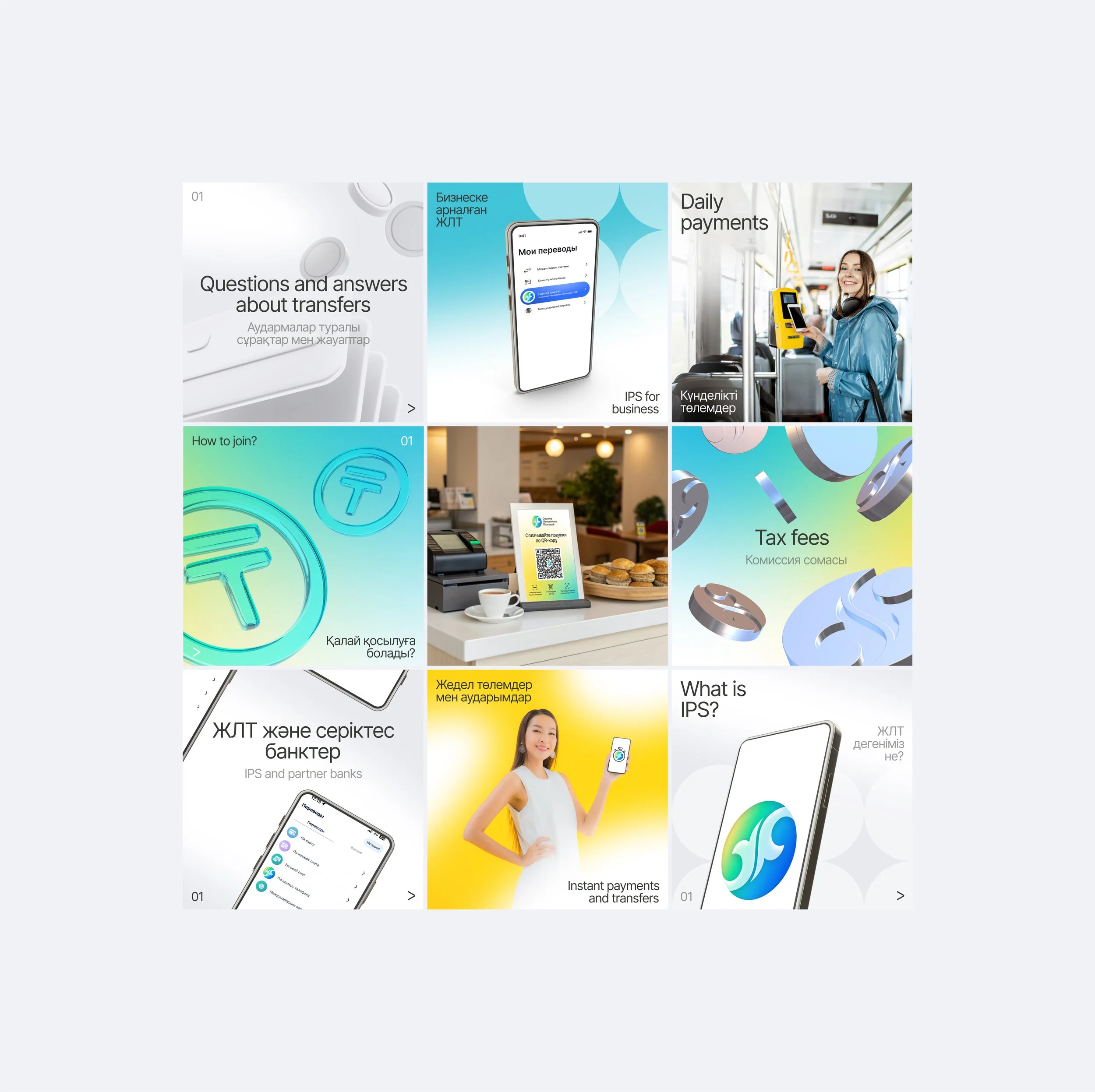
This helped IPS maintain a consistent and recognizable presence across the website, launch materials, stakeholder decks, product diagrams, and other communication assets.
Website & Product Communication
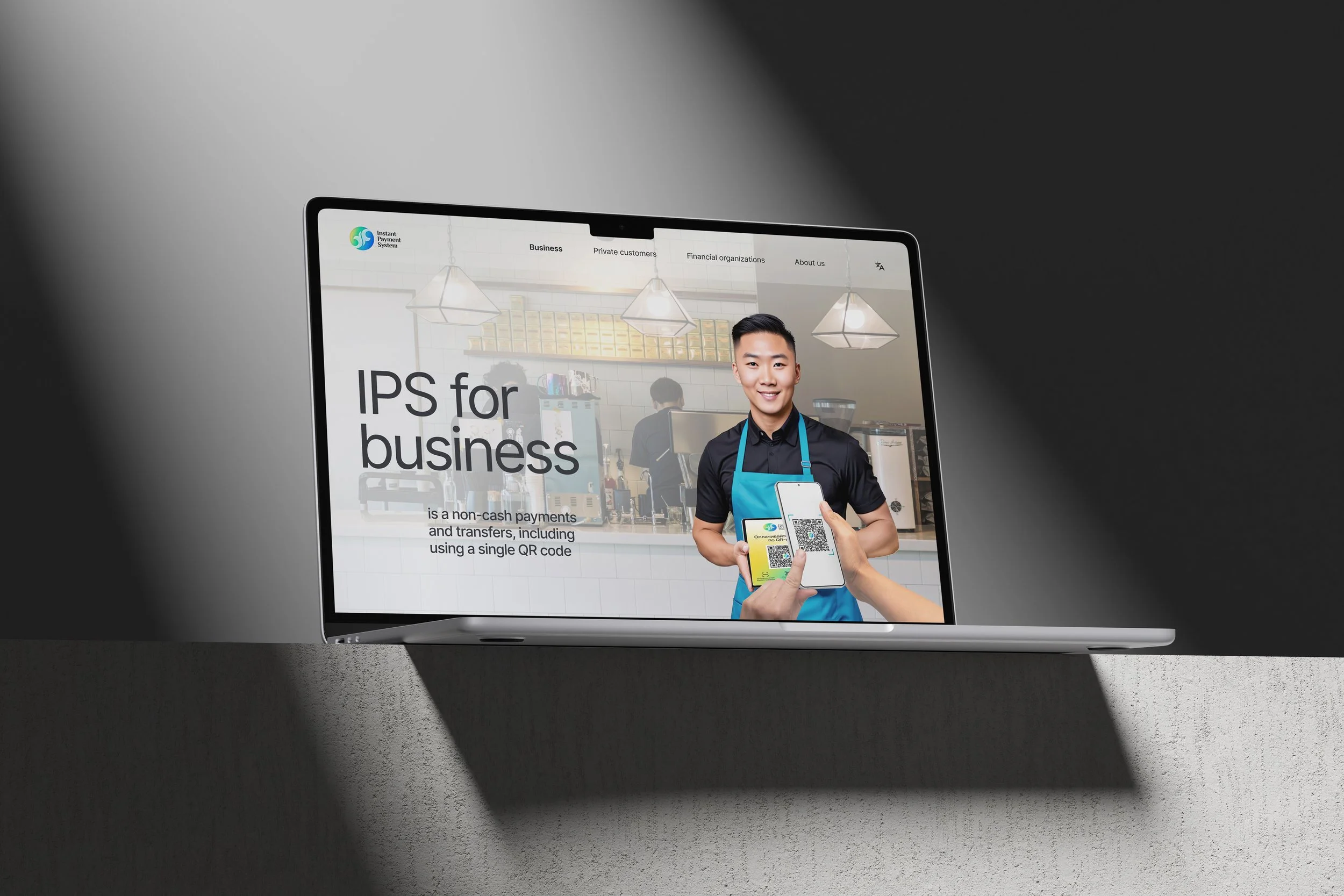
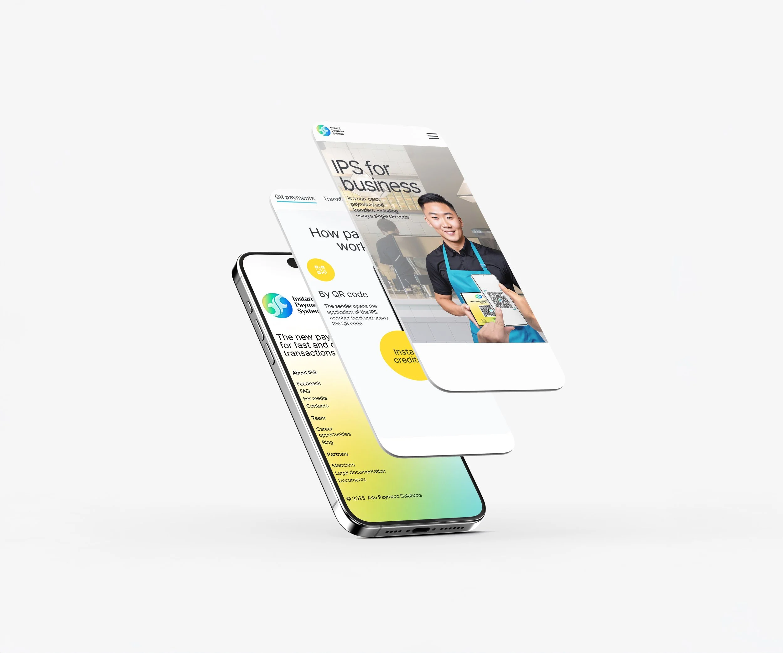
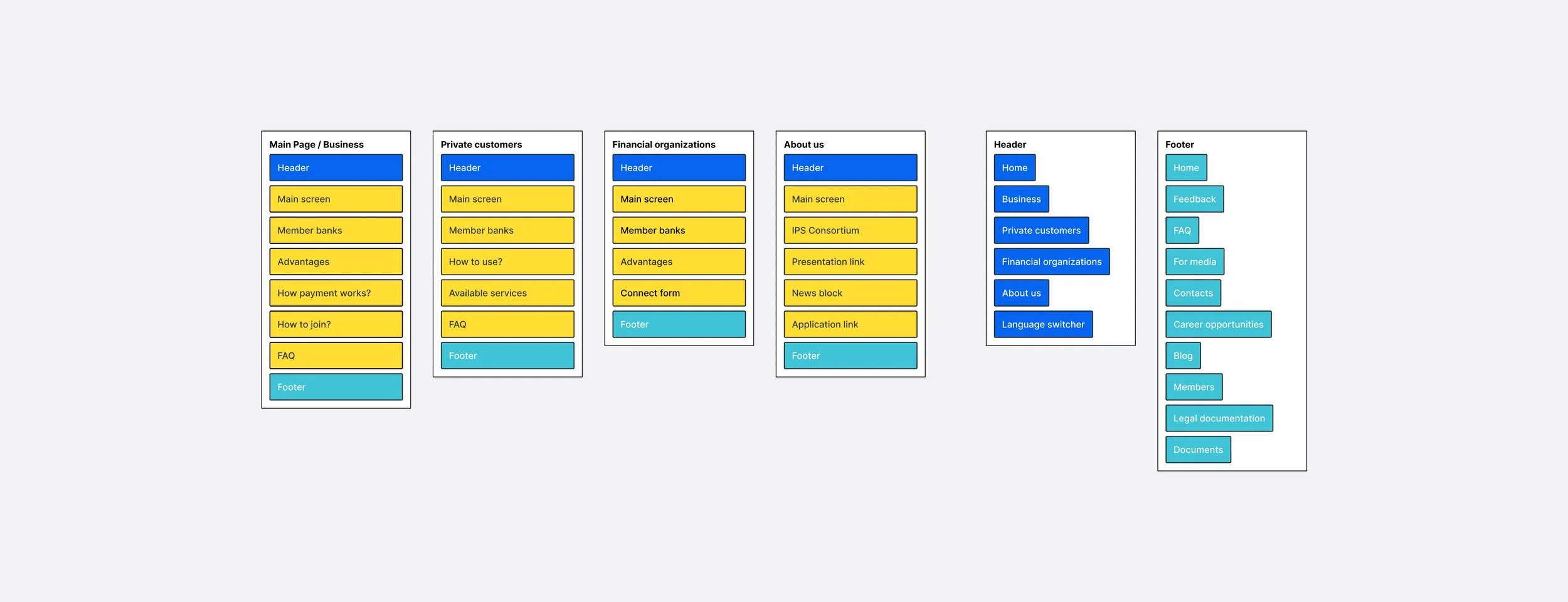
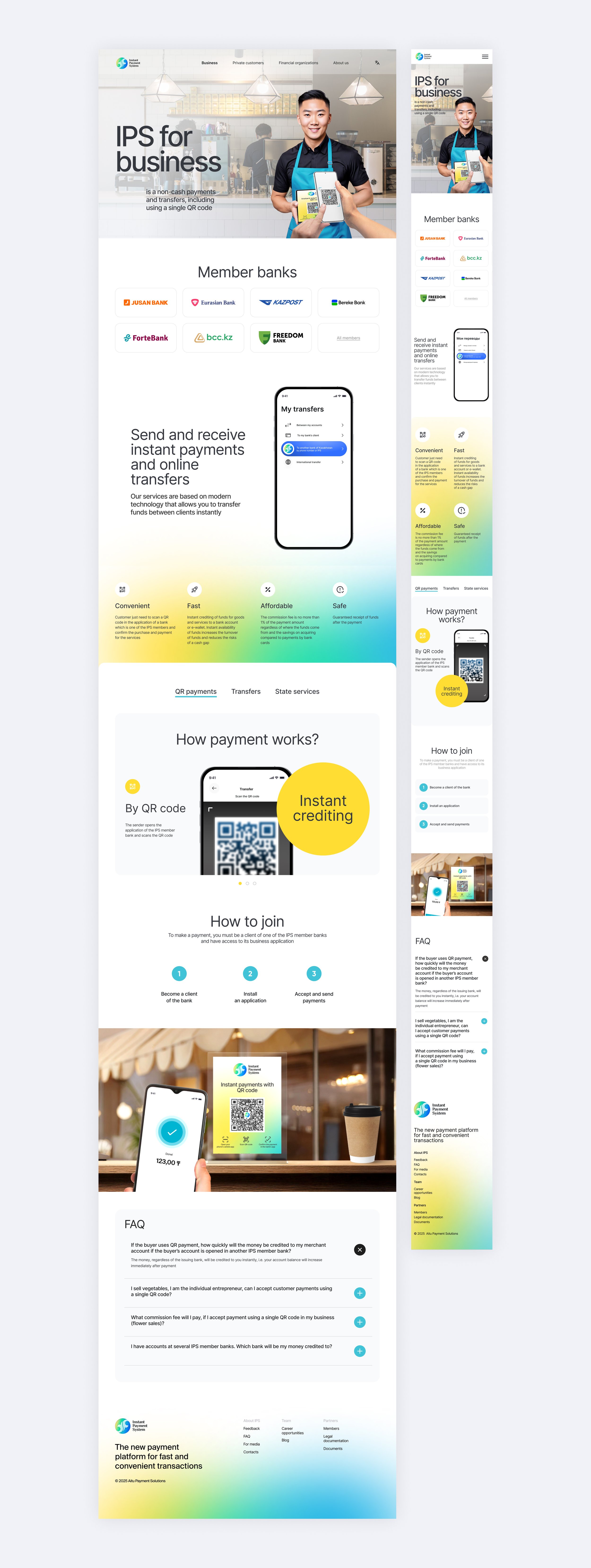
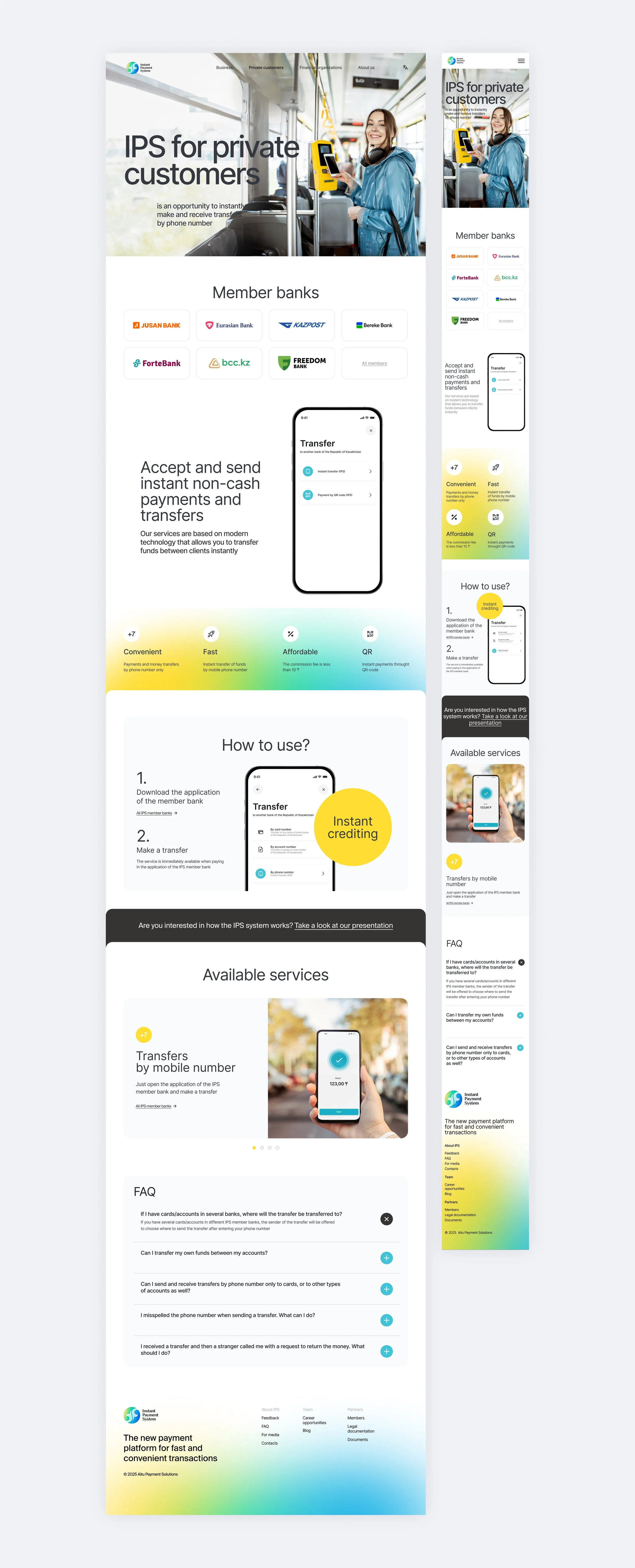
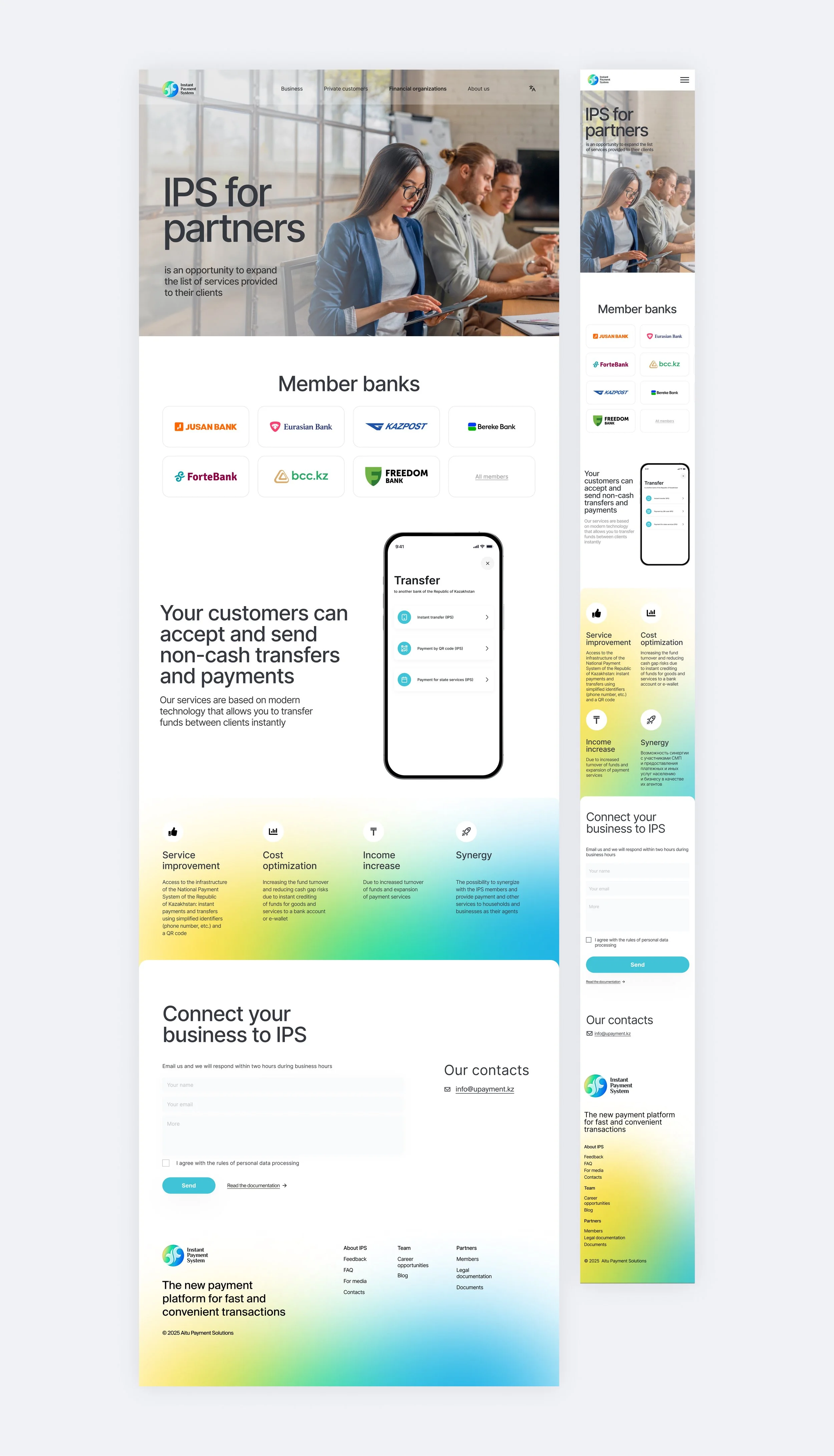
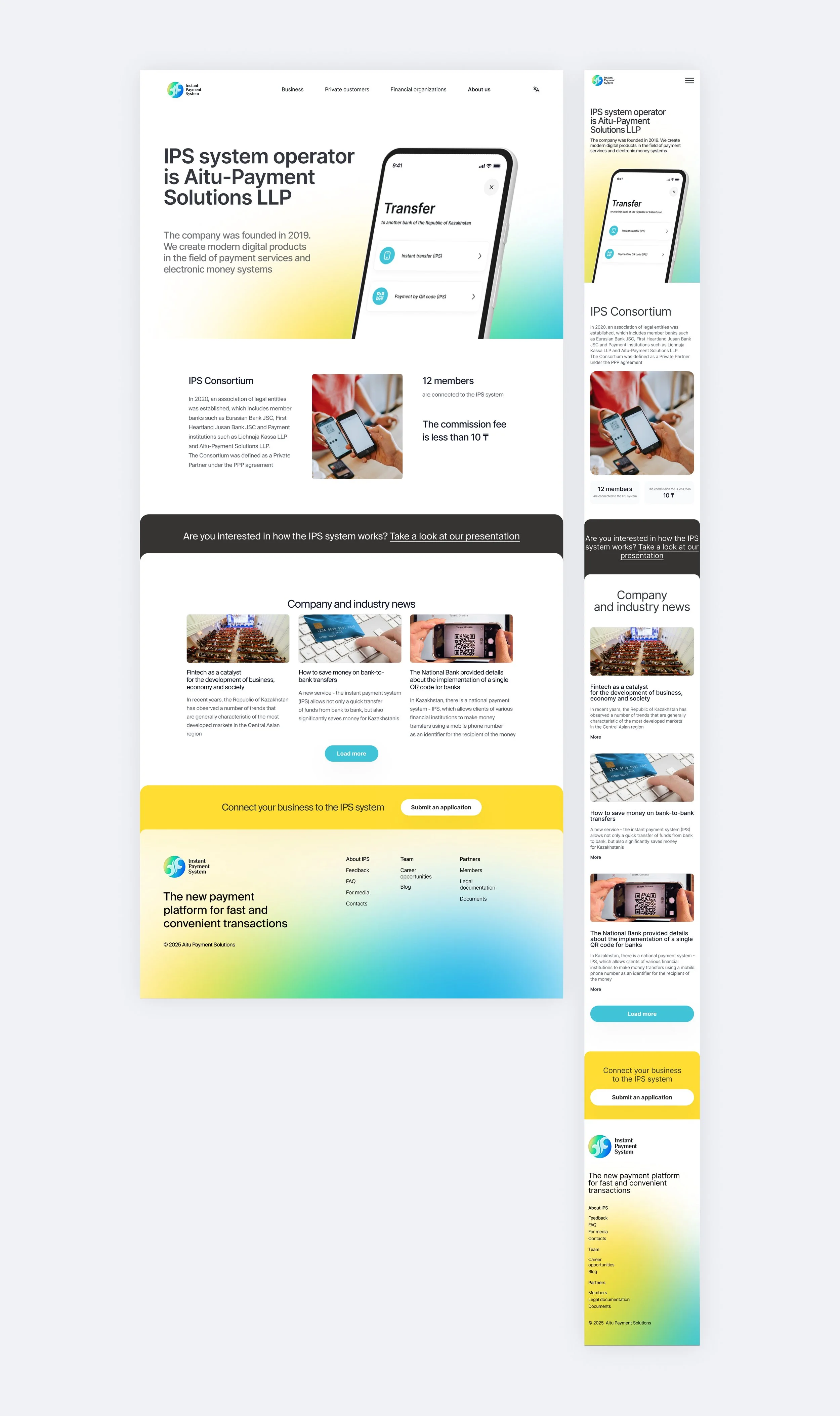
The website became one of the key touchpoints for explaining what IPS is, how it works, and why it matters for the financial market. Our work included structuring the content, designing the visual presentation of product benefits, and creating a clear hierarchy for complex information.
The communication had to balance two things: showing the technological strength of the platform while keeping the message accessible for non-technical decision-makers. We focused on clear explanations, concise benefit-driven messaging, and visual support for core payment scenarios.
This made the product easier to understand for banks, partners, businesses, and stakeholders evaluating the system.
Product Interfaces
We created interface concepts and product screens for key IPS scenarios, including transfers, QR payments, confirmations, transaction statuses, and error states. The work was developed in close coordination with product leadership and partner banks to align user flows, terminology, business logic, and technical constraints.
This helped turn complex payment operations into clear and trustworthy interface patterns that could support real banking scenarios and remain consistent with the broader IPS brand and product communication system.
Decision-Making
Because the product was launched from zero, many decisions had to be made without an existing visual or communication foundation. We tested different directions and evaluated them through the product’s business context: whether the system could explain the infrastructure clearly, support trust, work across different formats, and remain scalable as the product developed.
The final direction was shaped not only by aesthetics, but by product logic, audience needs, stakeholder communication, and the need to present IPS as a reliable national-scale fintech infrastructure.
Outcome
The final result was a complete brand and communication system for a fintech product launched from scratch. IPS received a recognizable identity, clear product narrative, website, presentation system, and supporting materials for business, partner, and stakeholder communication.
The system helped connect separate materials — website, product explanations, diagrams, sales presentations, and launch assets — into one consistent product experience. This gave the team a practical foundation for communicating the product’s value, reliability, and scale as IPS continued to grow.
Business Value
Our work helped IPS move from a complex technical product to a clear and presentable fintech brand. The communication system made it easier to explain the product to banks, partners, stakeholders, and users, supporting launch, adoption, and business development.
While the product’s technical performance was delivered by the engineering and product teams, our design work helped communicate these capabilities clearly: speed, reliability, security, transaction scale, and the value of instant payments for the financial ecosystem.
As a result, IPS gained a scalable visual and communication foundation that could support product growth, partner communication, public visibility, and future feature development.