

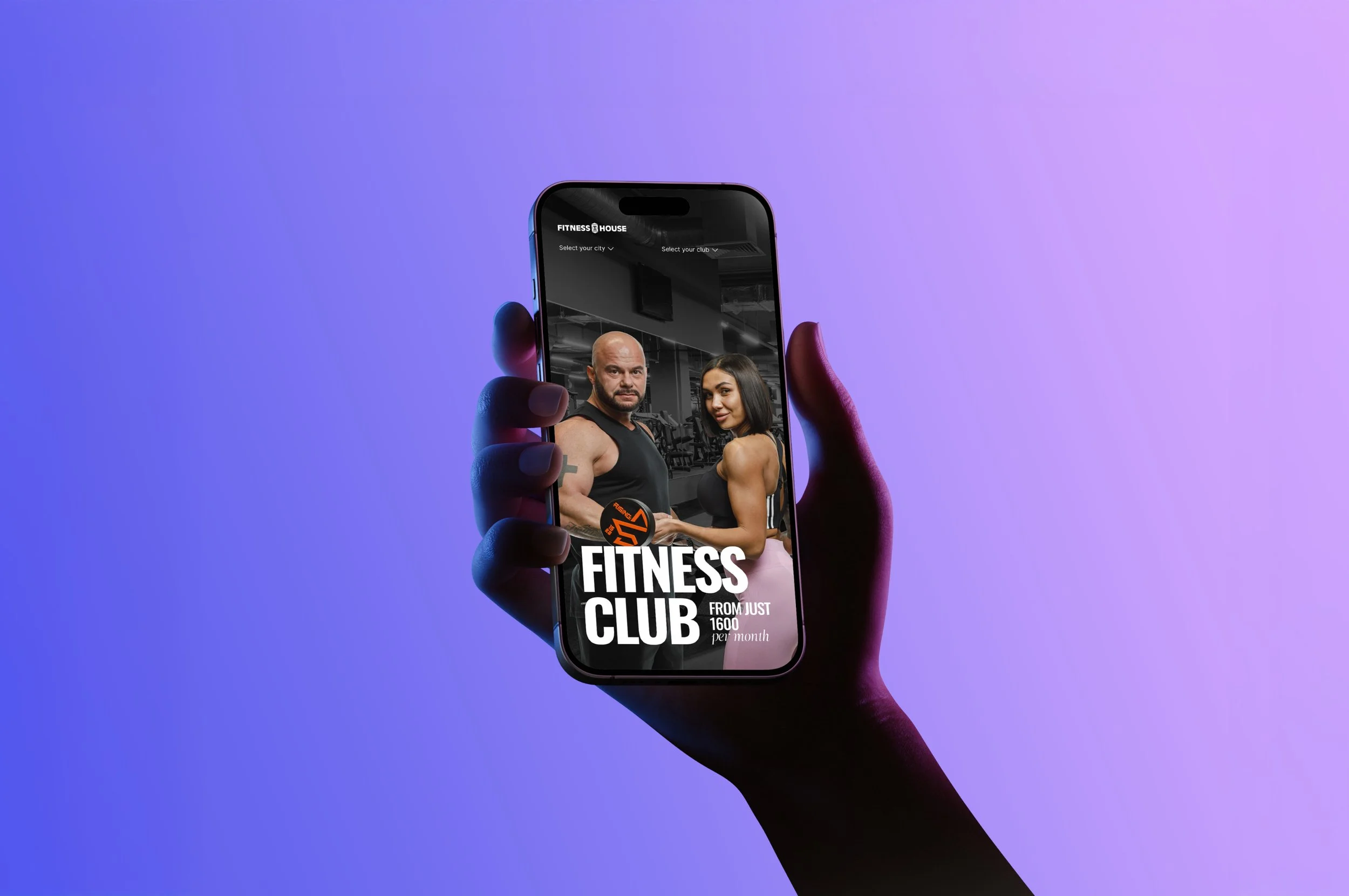
Fitness House
Overview
Fitness House is one of the most recognizable fitness club networks in Russia, with a strong reputation, a large regional presence, and a long history in the market. The brand has built trust through scale, accessibility, and a broad service offering that includes gyms, swimming pools, group classes, individual training, and spa areas.
The project focused on a new monthly subscription product designed to make fitness more flexible and accessible for a younger audience. Instead of asking users to commit to a long-term annual membership, the new offer introduced a more democratic model with monthly plans, clearer conditions, and a simpler path to purchase.
Our task was to rethink how Fitness House communicates this product: from campaign logic and visual language to tariff presentation, website structure, and the purchase flow. The goal was to help an established fitness brand compete with newer, more visually modern and youth-oriented competitors while keeping the strengths that already made Fitness House familiar and trusted.
Client
Fitness House
Impact metrics
Sports and Lifestyle
Industry
Art Direction
Brand Systems
Communication Design
Campaign Strategy
UX/UI Design
Product Communications
Visual Identity System
Competitive Research
Customer Journey Design
Role
The project was created for Fitness House, a large federal fitness club network with strong brand awareness and a long-standing presence in the Russian fitness market. The company opened its first club in Saint Petersburg in 2007 and has since grown into a multi-city network.
72 clubs across Russia
15 cities in the network
2007 first Fitness House club opened in Saint Petersburg
54 clubs redesigned in 2025 as part of the company’s broader modernization process
66 clubs in 12 cities by the end of 2021
2024 expansion into new regions, including clubs in Yekaterinburg, Tyumen, and a third club in Yaroslavl
2024 Brand of the Year according to the “Rating of Petersburg Brands” by Delovoy Peterburg, as referenced on the official Fitness House website
The new subscription product was introduced in a highly competitive fitness market. In Saint Petersburg alone, the number of fitness clubs grew by 13% from February 2024 to February 2025, reaching 971 locations, which made differentiation, pricing clarity, and digital conversion especially important.
The product itself was built around a monthly fitness subscription priced from 1,900 to 3,500 ₽, depending on the tariff. The offer included access to key club zones such as the gym, swimming pool, group classes, and spa area, with test clubs also offering more focused options like gym-only or gym + pool access.
This scale made the design challenge more strategic: the new communication system had to work not only as a visual refresh, but as a product and marketing tool for a recognizable national brand competing with newer, more flexible, and more youth-oriented fitness formats.

Business Context
Fitness House had strong brand awareness and a solid market reputation, but the competitive landscape was changing. Newer fitness brands were entering the market with brighter visual communication, more flexible offers, simpler registration flows, subscription models, and a tone of voice that felt more natural for younger users.
The business challenge was not to rebuild the company from zero, but to refresh how it communicates with a new generation of clients. The existing brand had scale and trust, but the new audience expected flexibility, speed, transparency, visual energy, and a low barrier to entry.
This was especially important because the fitness market was becoming more competitive. In Saint Petersburg, the number of fitness facilities grew by 13% from February 2024 to February 2025, reaching 971 locations, according to 2GIS data cited by Kommersant. The same report noted that the average monthly fitness club membership in Saint Petersburg was around 4,500 ₽, making price perception and subscription clarity important competitive factors.
Objective
The objective was to build a new communication and brand system for the Fitness House subscription product. The system had to help the company strengthen its position against competitors, attract a younger audience, and present monthly fitness as an easy, flexible, and low-risk way to start training.
The website needed to solve several practical tasks: catch attention from the first screen, make the design more modern and simple, clarify the tariff structure, remove duplicated information, add new content sections, and keep the page compact enough to remain easy to scan. These goals were directly defined in the project brief.
The final experience had to work as both a campaign landing page and a product purchase flow: explain the offer, build motivation, help users choose the right plan, show what is included, answer objections, and move them toward subscription purchase.


Research Approach
We approached the project as a product communication task rather than only a visual redesign. Before moving into design, the work required understanding the market, competitor offers, younger users’ expectations, barriers to purchase, and the role of subscription models in changing fitness behavior.
The research was structured around three directions: competitive analysis, audience research, and hypothesis validation. This helped connect the future visual system and website flow with real business and user needs rather than relying only on stylistic assumptions.
The main question was: how can Fitness House make its monthly subscription feel more relevant, flexible, and attractive for younger clients while preserving the trust and scale of an established national fitness network?
Competitive Analysis
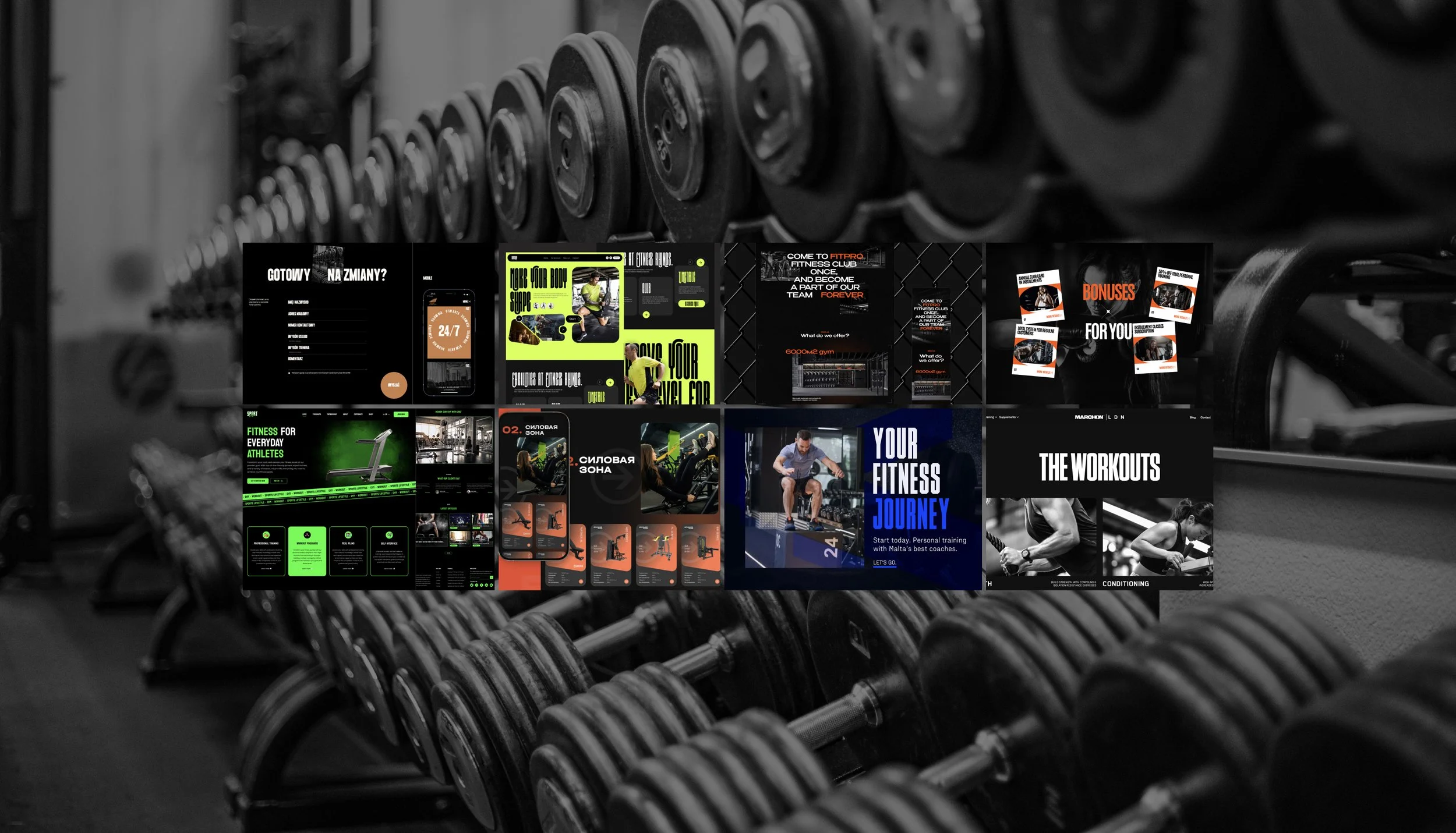
The first research direction focused on competitors and market benchmarks. The goal was to understand how newer fitness brands attract younger audiences, how they present subscription-based offers, and where Fitness House could differentiate itself.
The project brief identified several direct and reference competitors, including DDX Fitness, Spirit Fitness, SportWorks, XFIT Point, World Class, and Fitmost. The notes highlighted competitors’ strengths such as bright visual style, simple websites, fast registration, subscription-based models, promotional mechanics, 3D club tours, and modern digital presentation.
The competitive analysis helped define what the new system needed to improve: visual relevance, clarity of tariff comparison, speed of decision-making, stronger first-screen communication, and a more frictionless path from interest to purchase.
Research methods
Mystery shopping — to map the real customer journey from website visit to trial visit or subscription purchase.
Website and social media benchmarking — to compare visual style, offer structure, tariff models, tone of voice, registration flow, and promotional mechanics.
Review analysis — to identify repeated customer pain points, such as unclear pricing, pushy sales, outdated facilities, inconvenient registration, or low transparency of conditions.
Offer comparison matrix — to compare monthly subscriptions, annual memberships, student discounts, “night fitness,” installment options, trial formats, and flexible access models.
Audience Research
The second research direction focused on the new target audience. The project had to speak to younger users who do not always plan their life around long-term commitments and may not be ready to buy an annual fitness membership immediately.
The brief described several key audience segments: young people 16+ who cannot buy an annual membership or do not know what their schedule will look like, adults 25+ trying fitness for the first time, people preparing for a short-term goal, business travelers, users who previously bought annual memberships but rarely used them, and people who want to test a club near home, work, or university before making a longer commitment.
This shaped the product logic: the subscription needed to feel simple, affordable, reversible, and easy to start. For younger users, the offer had to reduce fear of overpaying, fear of losing motivation, and fear of being locked into a long contract.
Research methods
CustDev interviews with users aged 16–25 and 25+ to understand motivations, price sensitivity, fitness habits, emotional barriers, and reasons for choosing or avoiding fitness clubs.
Interviews with active and inactive users to compare people who already go to fitness clubs with those who want to start but postpone the decision.
Co-creation sessions where participants could assemble an “ideal subscription” and choose preferred formats, benefits, payment logic, club access, and motivational features.
Price sensitivity testing using the Van Westendorp method to define what price feels too cheap, acceptable, expensive but possible, or unacceptably expensive for the target audience.
The research showed that younger users evaluate fitness differently from traditional annual membership buyers. They are less likely to commit to a full year immediately and more likely to compare fitness with other monthly services: streaming, mobile subscriptions, delivery services, education platforms, and lifestyle apps.
The key insight was that the product had to feel like a flexible everyday subscription, not like a long-term financial obligation. This changed both the communication strategy and the website flow: the focus shifted from “buy a club card” to “start training this month in a format that fits your life.”
Key insights
Flexibility matters more than commitment
Younger users want to start without feeling locked into a long contract.
The first month is a trial period
Many users want to test the club, route, schedule, equipment, pool, and atmosphere before choosing a longer plan.
Price clarity affects trust
The tariff system must be easy to compare, without duplicated information, hidden conditions, or confusing differences between plans.
Fitness is emotional, not only functional
For younger audiences, fitness is connected to confidence, appearance, mental health, content, community, and lifestyle.
The website must sell fast
Users need to understand the offer quickly: what is included, how much it costs, which club is available, and how to pay.
Campaign Concept
Product Strategy
The product strategy was built around the idea of monthly fitness as a flexible, low-risk entry point into the Fitness House ecosystem. Instead of positioning the subscription as a secondary offer, the communication had to present it as a modern and independent product for people who want to start training without long-term pressure.
This shaped the entire system: campaign messaging, tariff structure, website hierarchy, visual identity, and conversion flow. The subscription needed to feel simple enough for first-time users, attractive enough for young audiences, and credible enough to benefit from the scale and reputation of Fitness House.
The core message became: fitness should be easier to start, easier to understand, and easier to fit into everyday life.
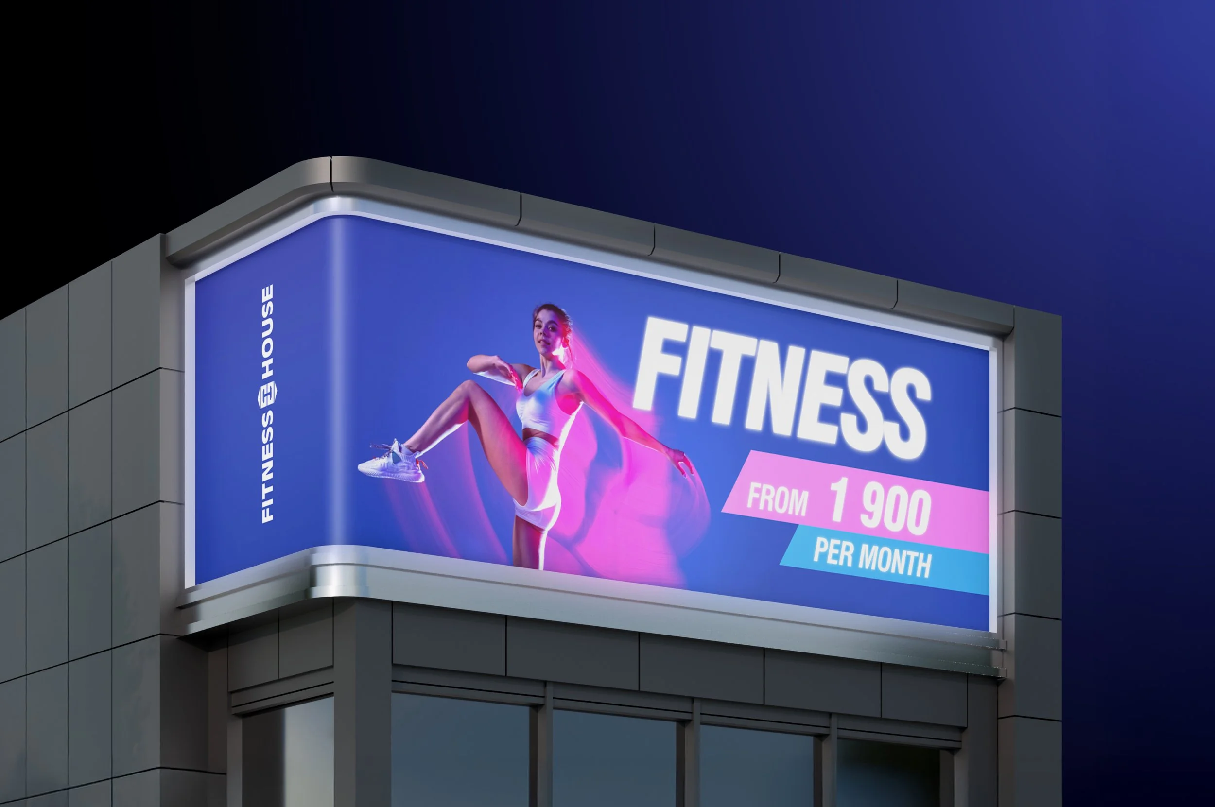
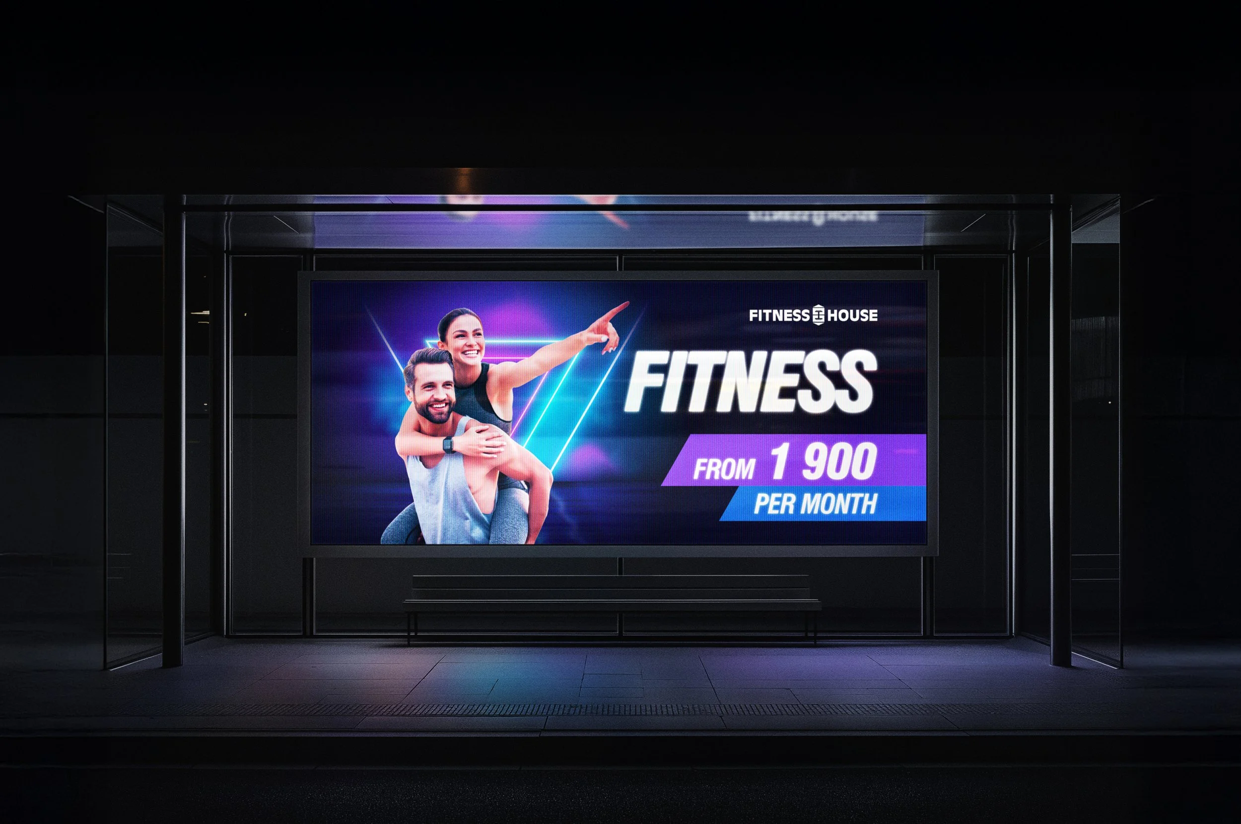
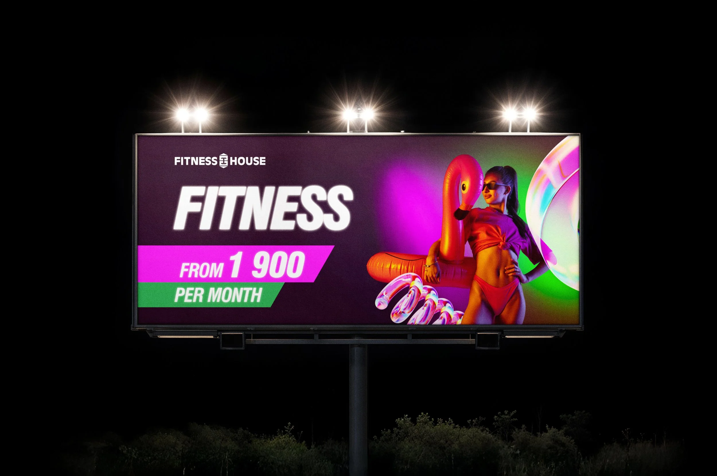
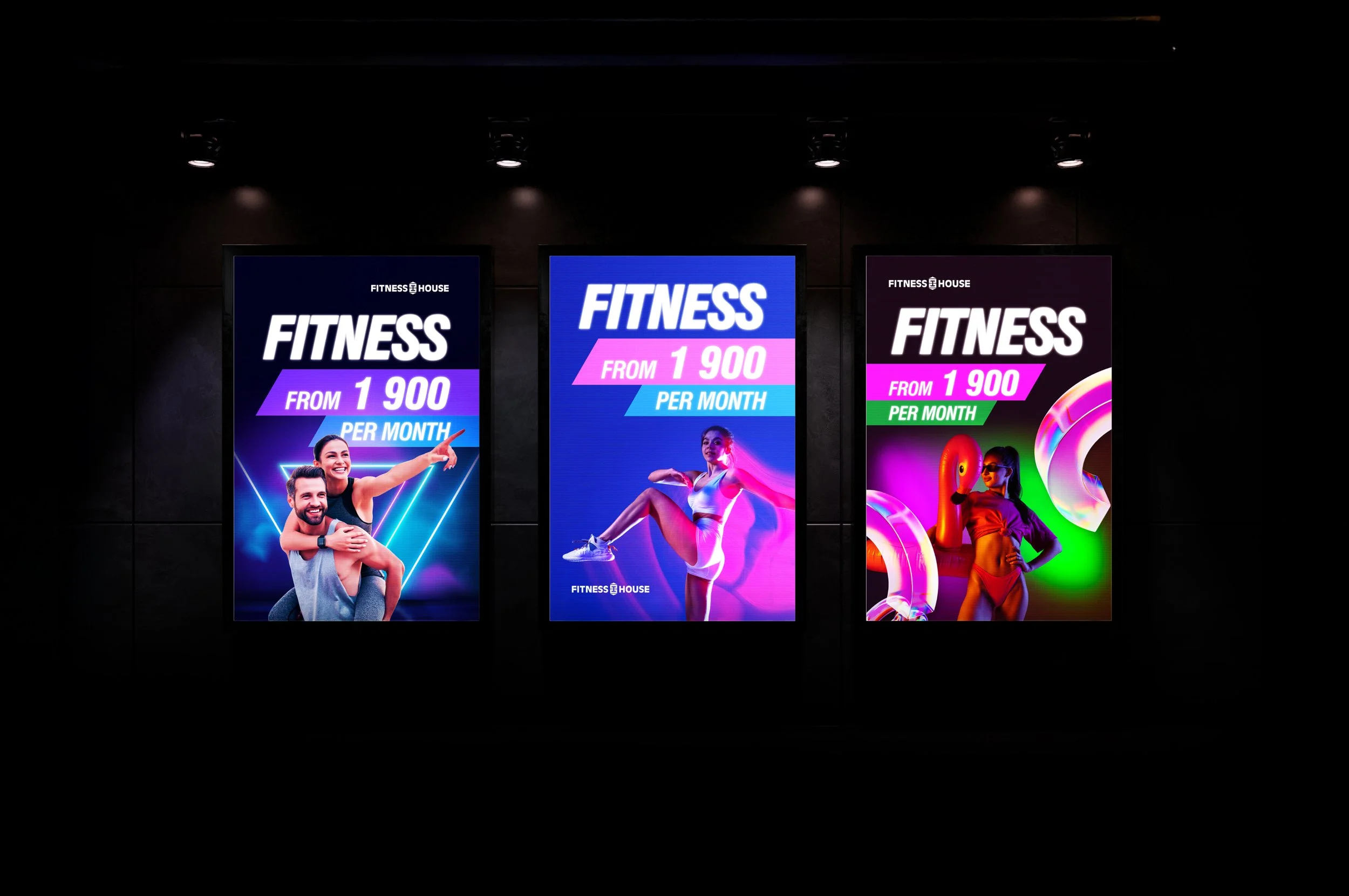
The campaign positioned the monthly subscription as an easy way to start training without overthinking. The communication focused on everyday motivation, simple entry, flexible conditions, and the ability to test fitness without a long-term commitment.
This helped shift the offer from a purely transactional discount message to a lifestyle-oriented product story. The subscription was presented as a format for people whose schedule, motivation, budget, or goals can change from month to month.
The campaign had to work across digital channels, website sections, promotional blocks, and conversion-focused tariff cards. Its role was to make Fitness House feel more modern and approachable while still communicating the reliability of a large fitness network.
Campaign Concept



Brand System
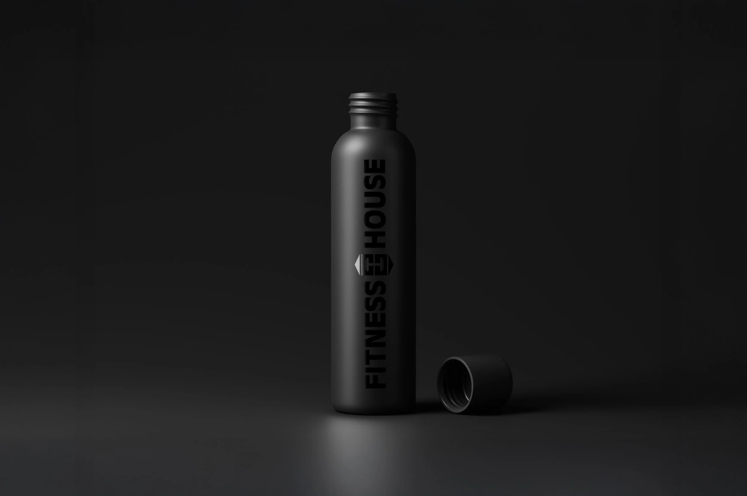
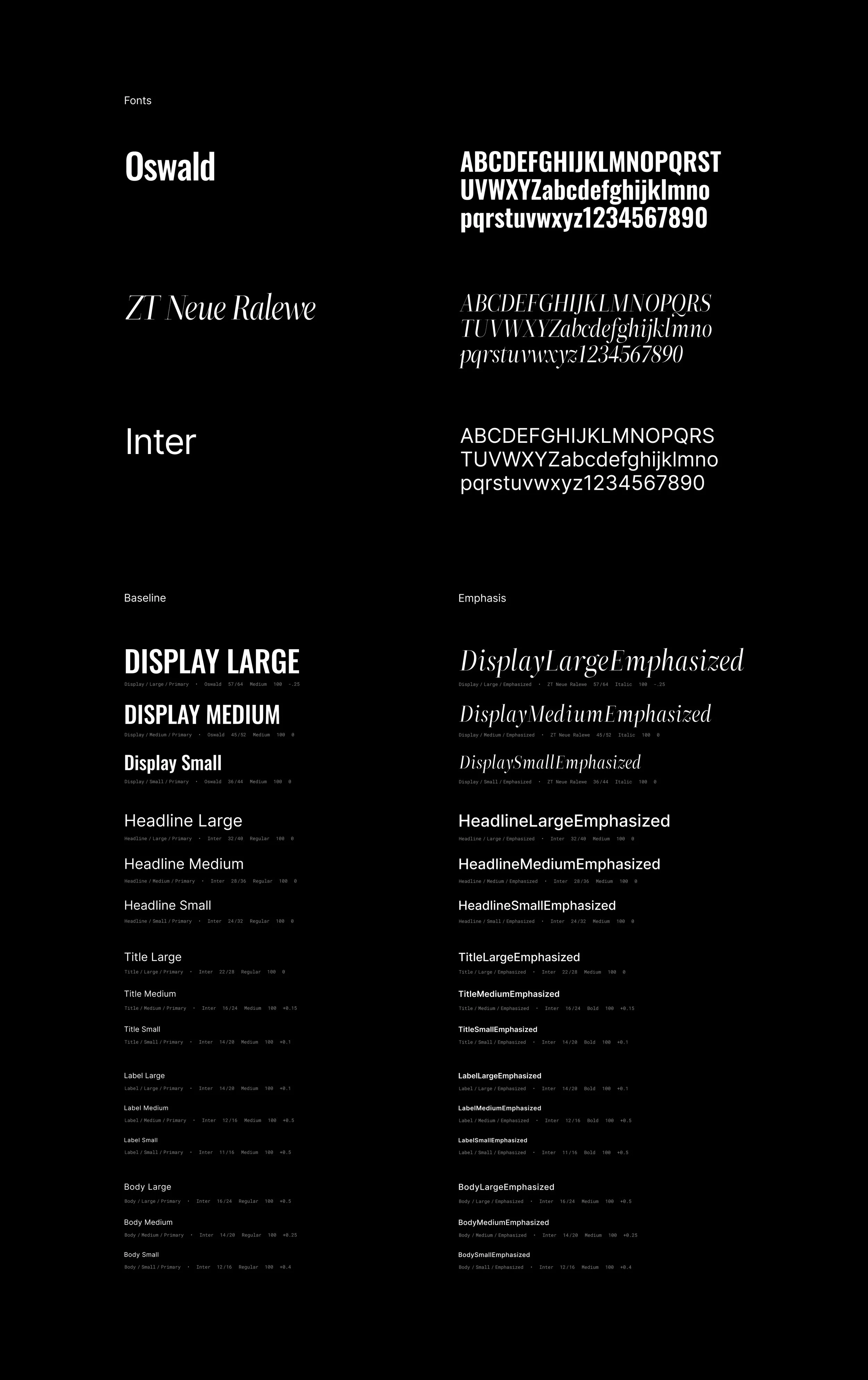
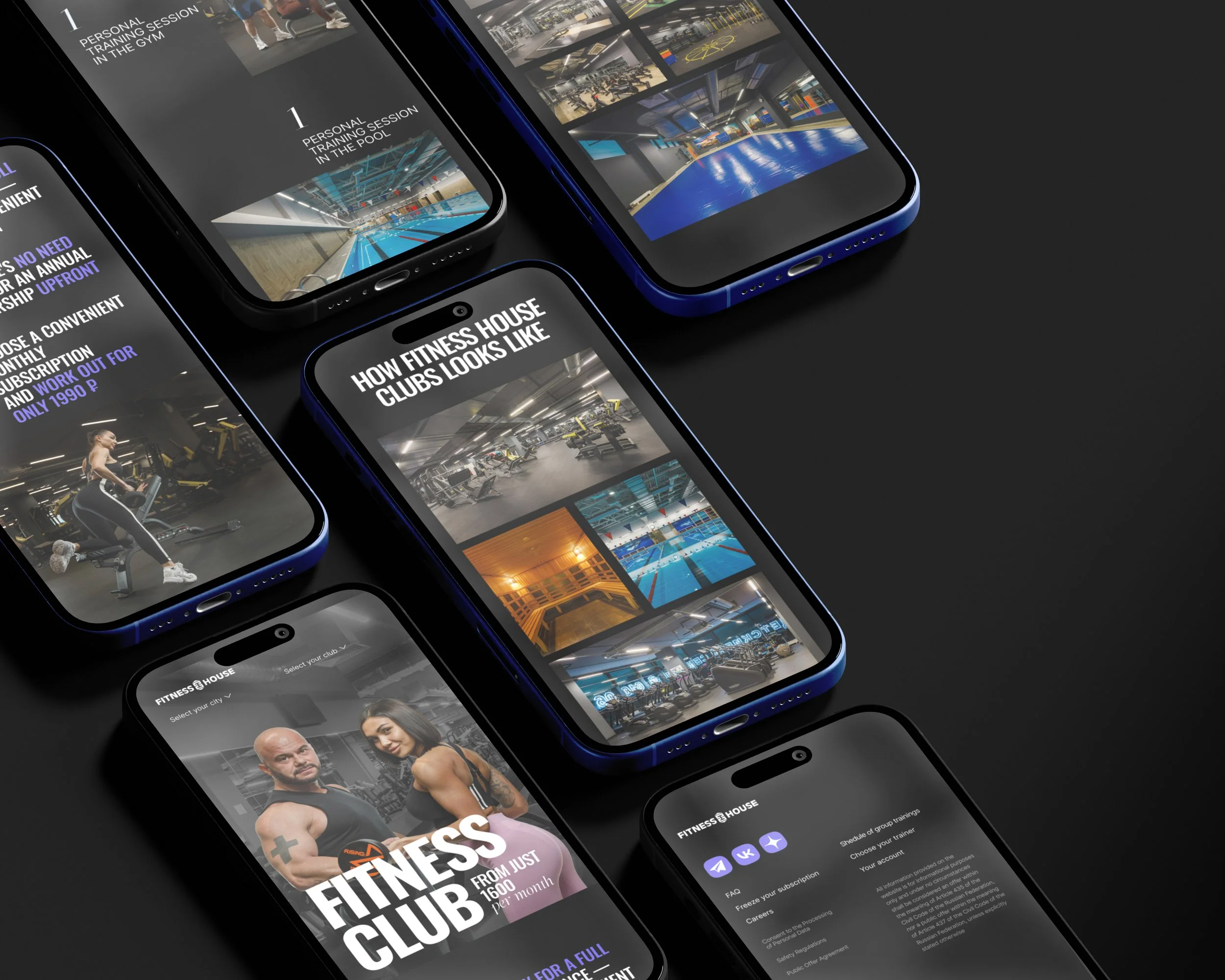
The brand system was developed to support a younger and more flexible product while preserving the existing Fitness House recognition. The visual direction used brighter accents, clearer typography, dynamic compositions, club photography, and more expressive campaign blocks.
The goal was not to reject the existing brand, but to make it work in a more competitive digital environment. The system had to feel simple, energetic, and commercial — strong enough for advertising, structured enough for tariffs, and practical enough for website and product communication.
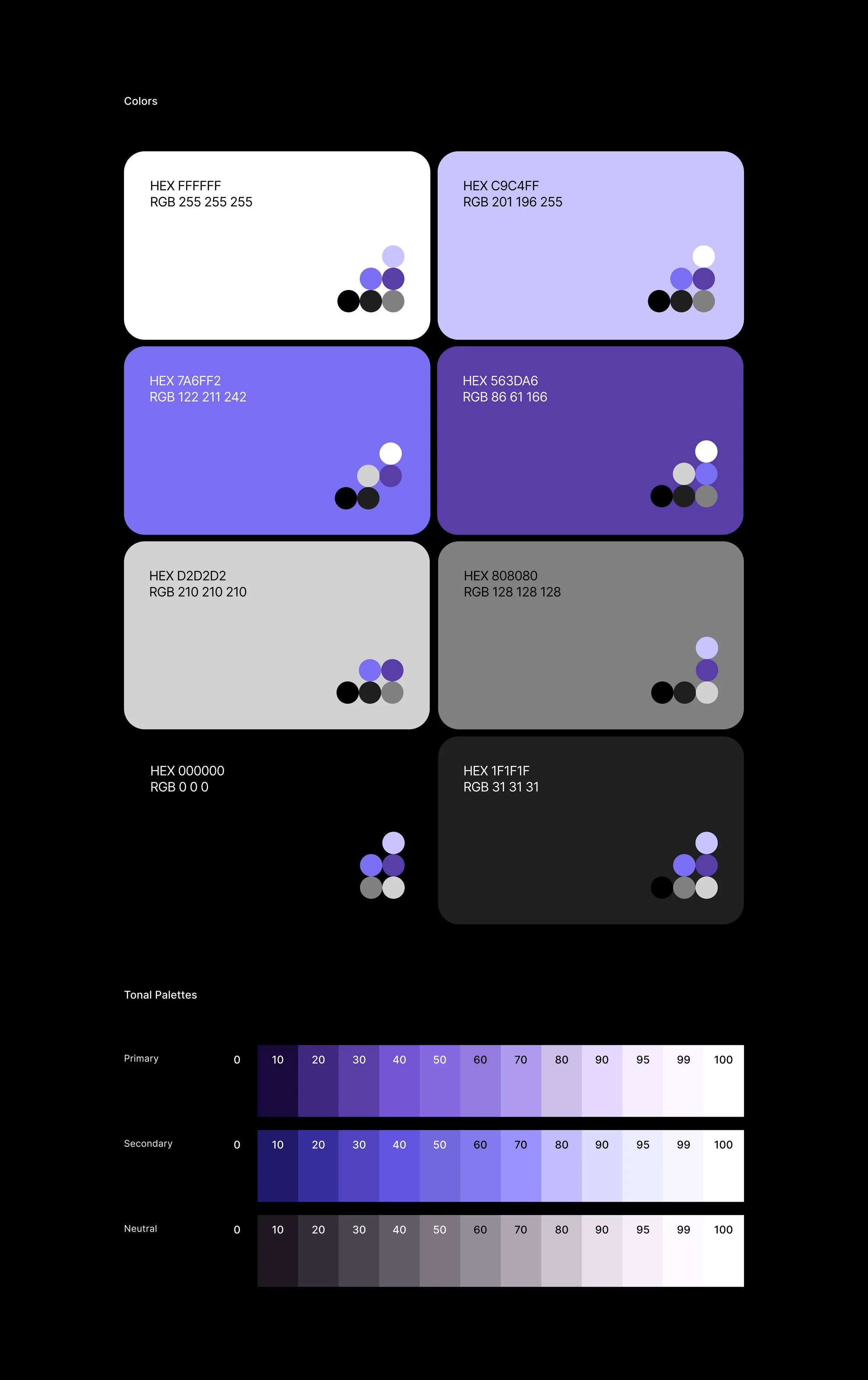
The visual system also responded to the brief’s design requirements: keep brand color elements, avoid yellow-blue combinations, avoid dominant red or green, explore light, dark, and neon directions, and use a more modern, simple style with bright accents, forms, 3D effects, club photos, video, and animation references.
Visual Direction
The final visual direction balanced three needs: brand continuity, youth relevance, and product clarity. The system used large expressive typography, high-contrast blocks, energetic color accents, simplified layouts, and visual elements that made the subscription feel like a modern digital product.
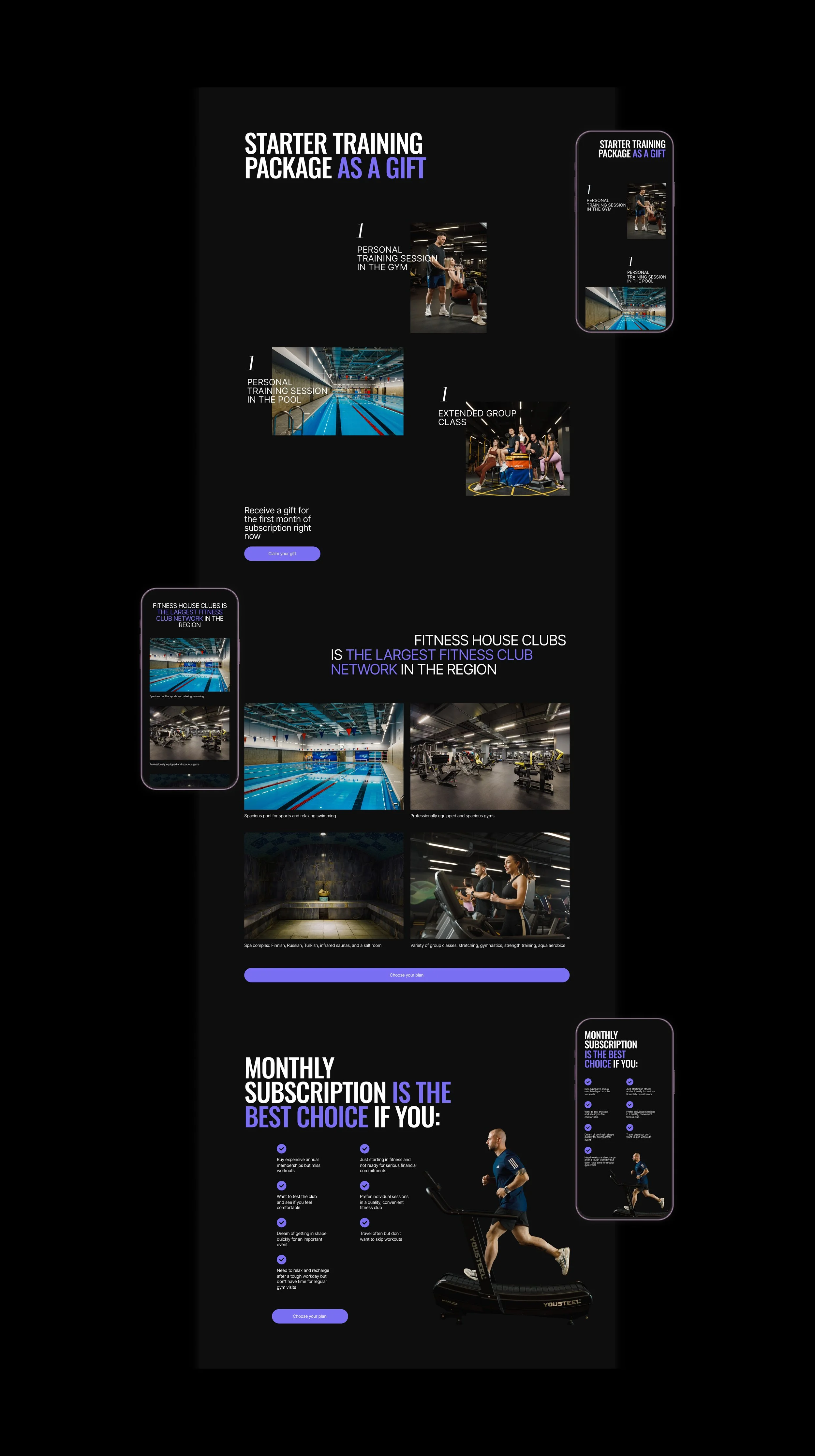
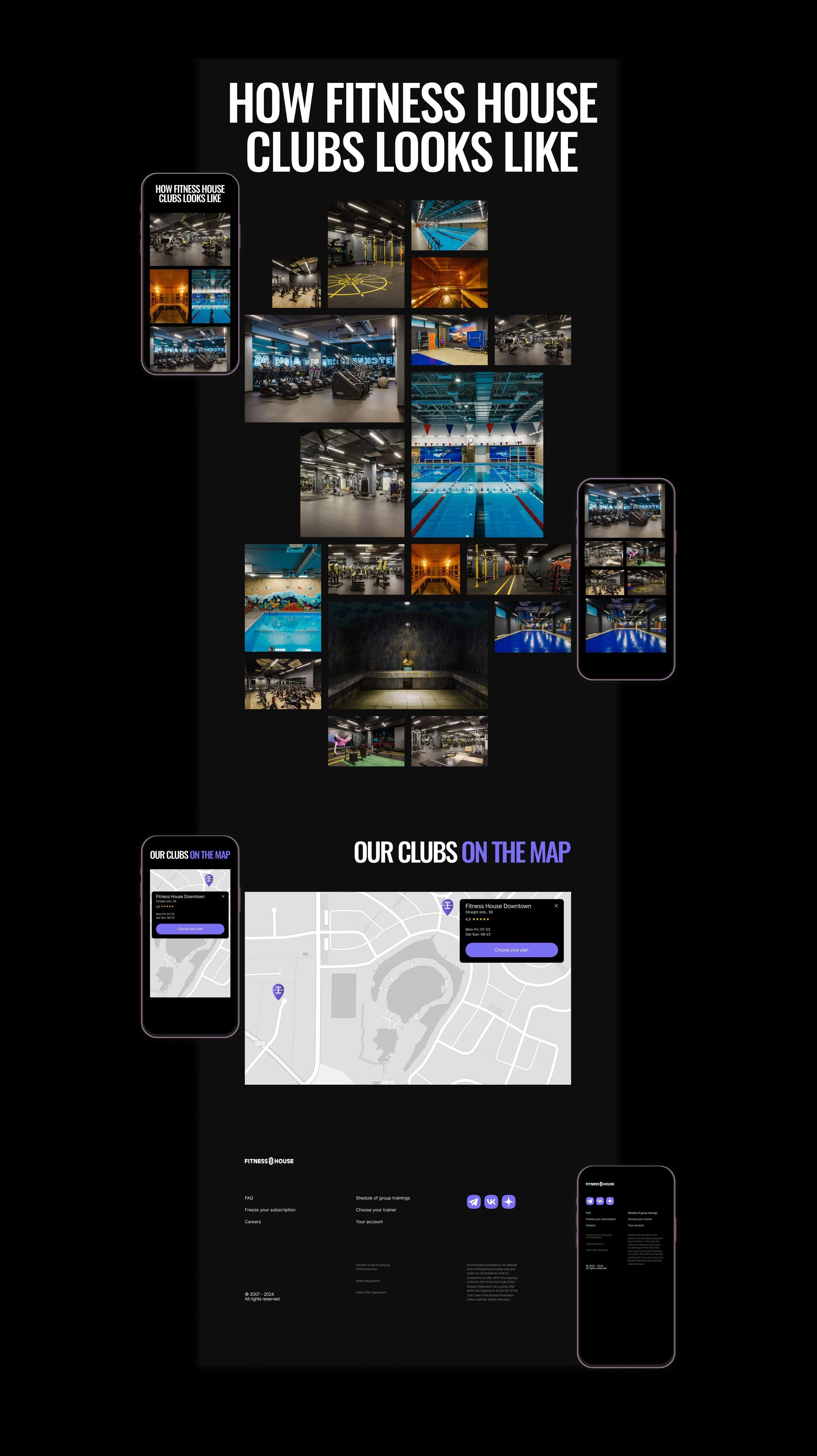
Photography played an important role. Instead of using only abstract fitness visuals, the website relied on real club spaces, equipment, pools, and training environments to build trust and make the offer tangible.
The overall style was designed to compete with newer fitness brands without becoming overly decorative. It had to feel bold enough to catch attention, but clean enough to support pricing, benefits, conditions, and purchase steps.
Website Structure
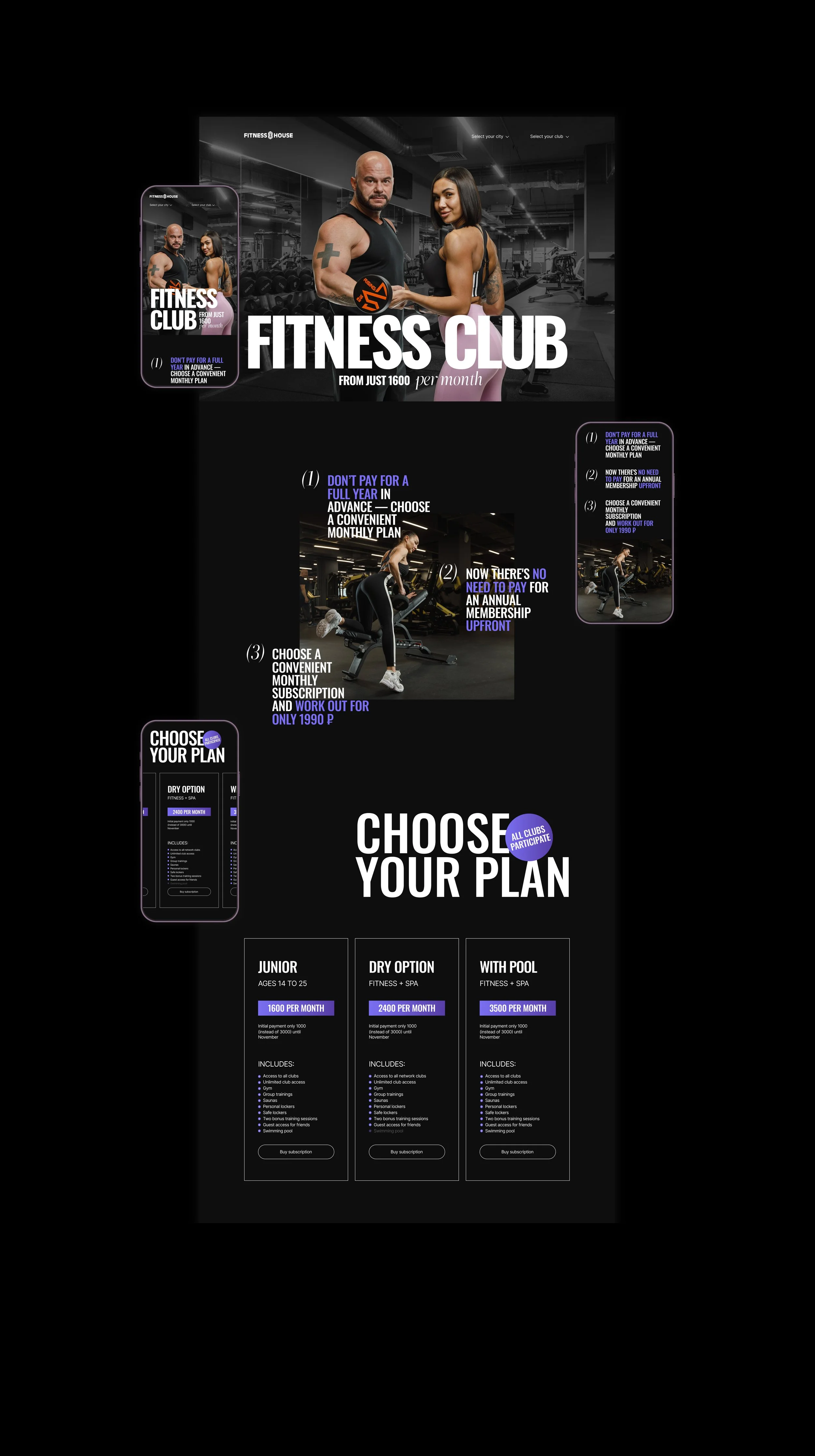
The website was designed as a conversion-focused product page. It had to explain the subscription quickly, guide users through benefits and tariffs, show what is included, and help them understand how to buy.
The brief defined the expected website structure: header with USP, benefits, tariffs, promotion block, what is included, how to buy a subscription, club information with map and photos, and footer.
We used this structure as the foundation for a clearer user journey:
1. Attention — a strong first screen that immediately communicates the subscription offer.
2. Understanding — short explanation of how monthly fitness works.
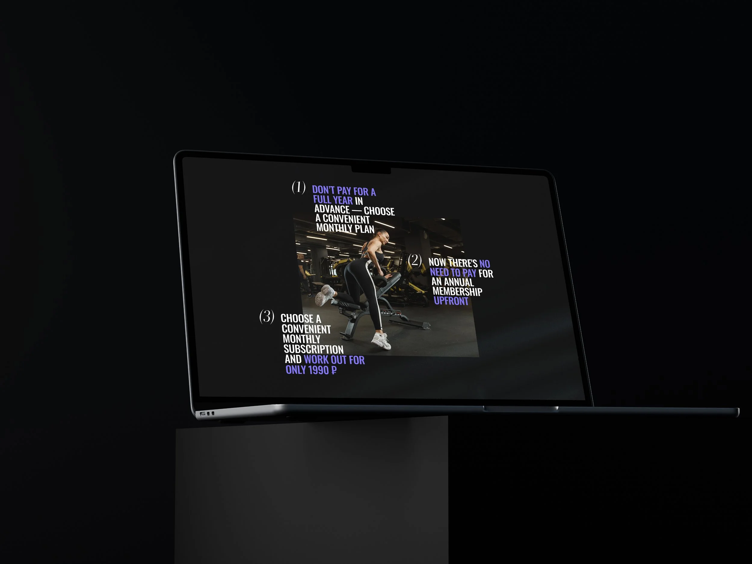
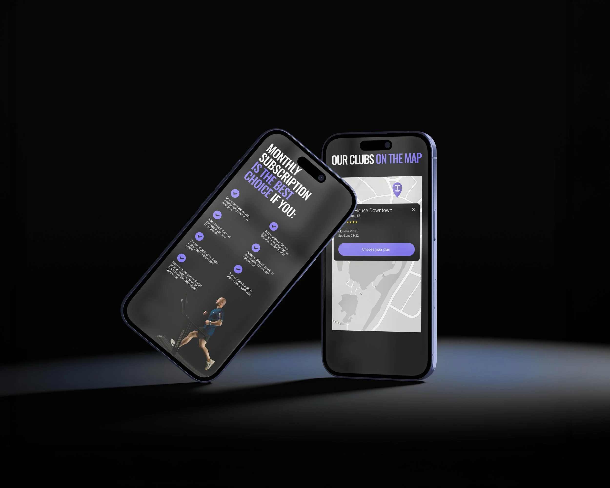
3. Motivation — benefits that reduce purchase anxiety and show why the format is convenient.
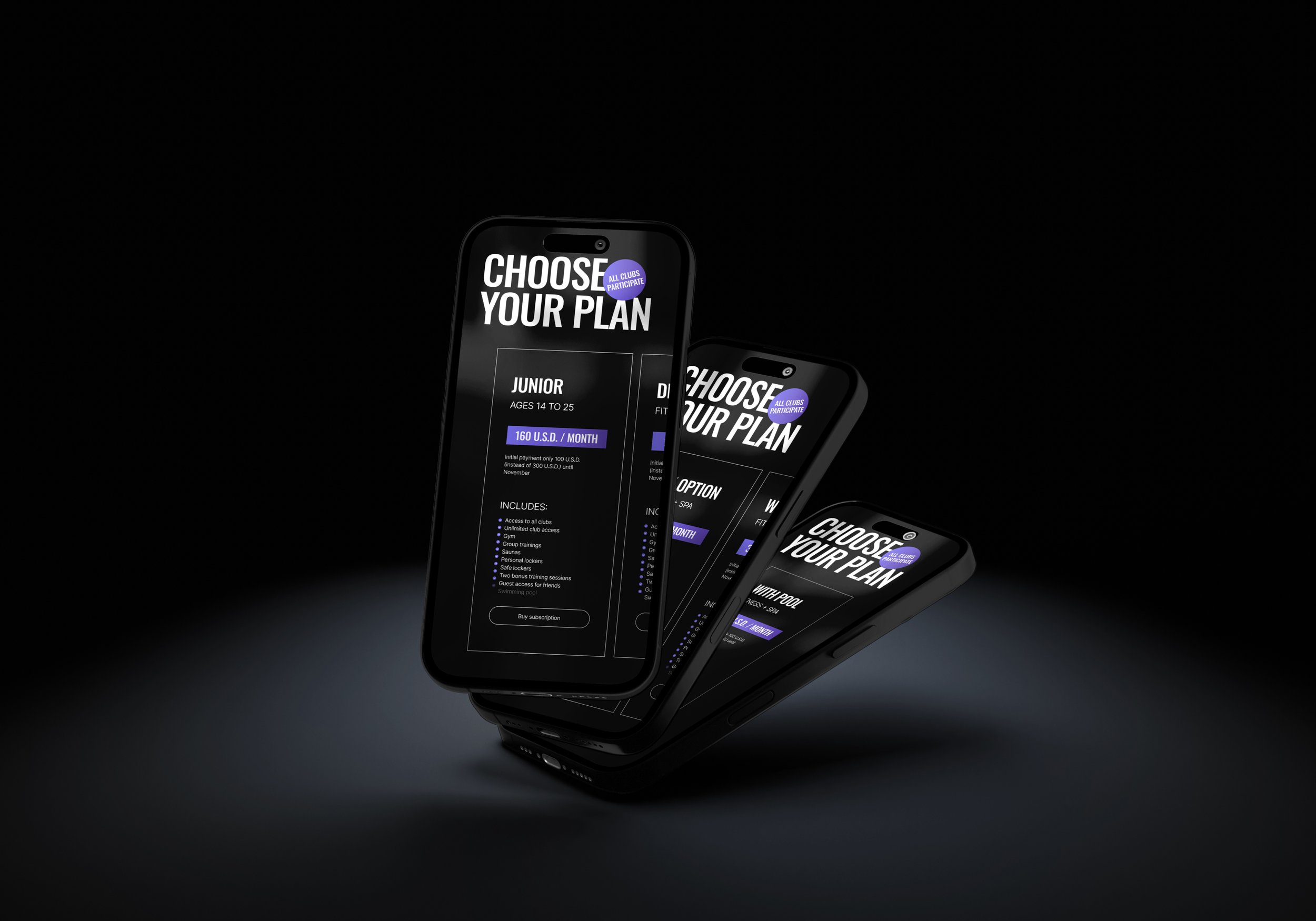
4. Comparison — tariff cards that make it easy to choose the right plan.
5. Confidence — explanation of what is included and how clubs can be accessed.
6. Action — clear purchase steps and payment flow.
7. Support — map, club information, FAQ, app, and account links.
Tariff UX
One of the key UX tasks was to make tariffs easier to compare. The previous implementation did not communicate the new subscription product clearly enough because it existed inside an environment built primarily around annual membership sales. The brief directly stated that the current online store implementation was not suitable because it focused on annual tariffs.
We redesigned the tariff presentation around quick comparison and decision-making. Users needed to understand the difference between plans, price levels, club access, included zones, and possible limitations without reading long explanations.
The tariff section was treated as the main decision point of the page. It had to combine commercial clarity with product logic: what I get, how much I pay, what is included, how I choose, and what happens next.
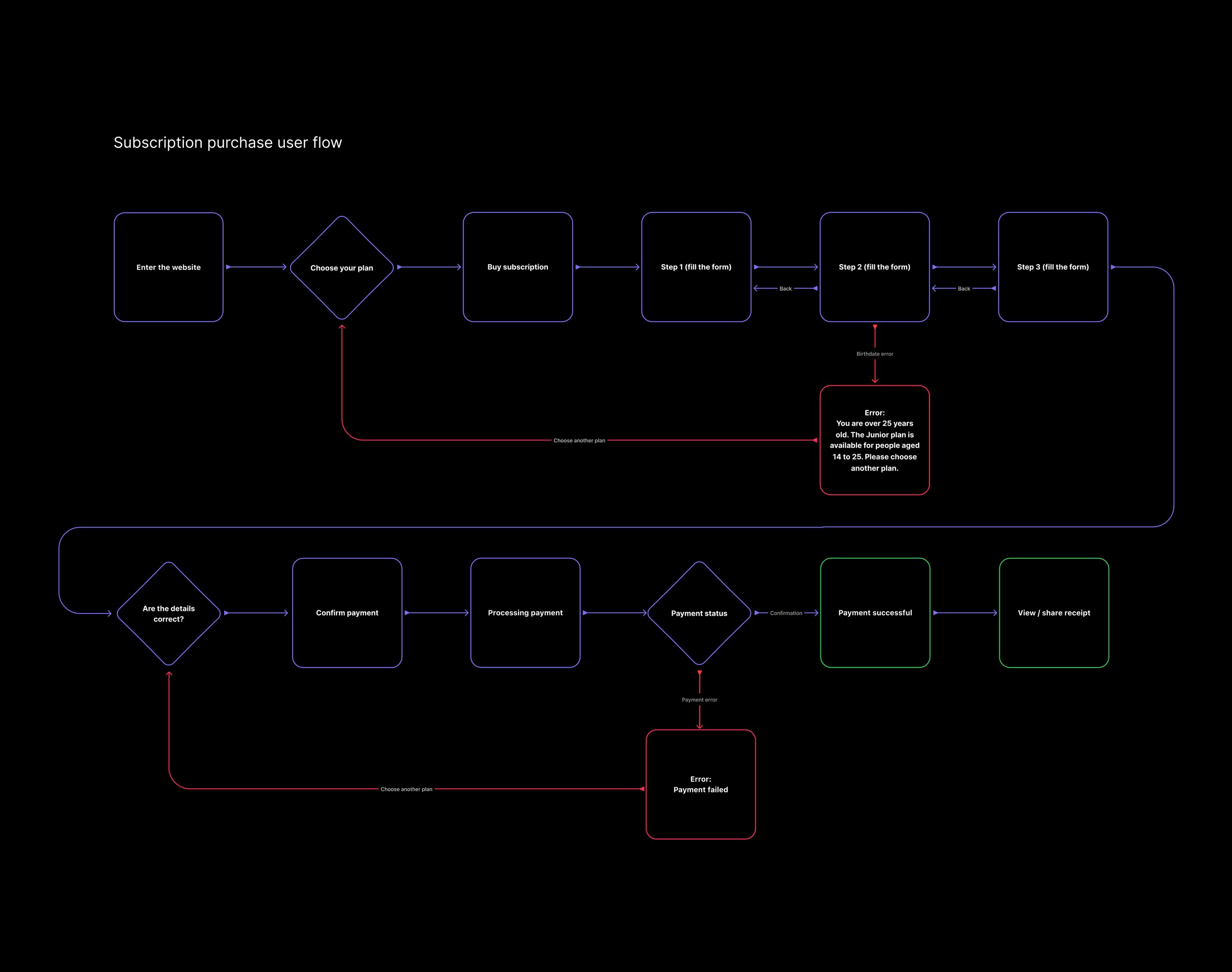
Purchase Flow
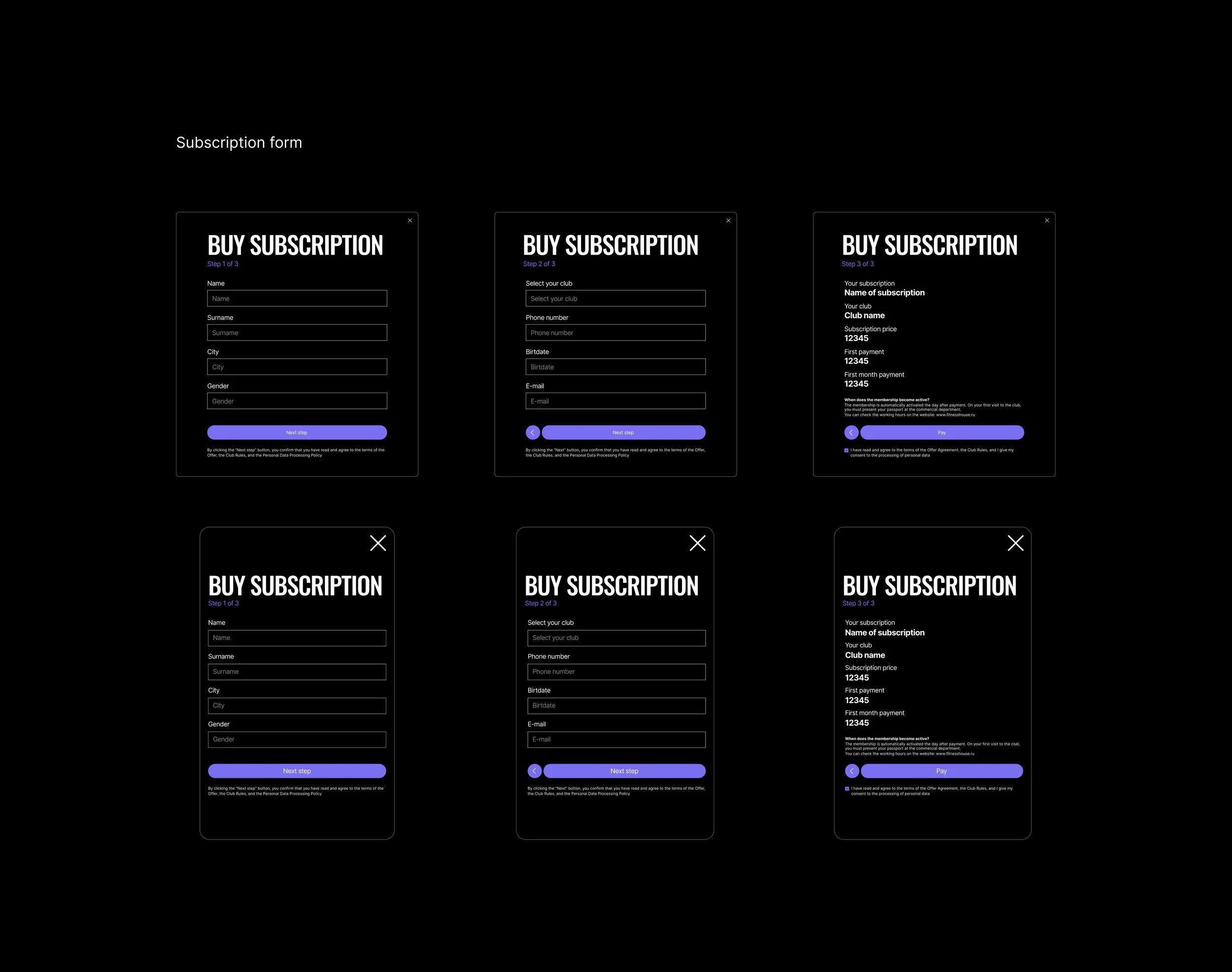
The purchase scenario was designed around a simple path: choose a tariff, check what is included, select a club or access option, move to payment, and receive confirmation. The goal was to reduce friction and make the subscription feel as easy to start as other monthly digital services.
This flow was especially important for younger audiences who expect speed and transparency. Long forms, unclear conditions, and aggressive sales mechanics could break trust before purchase.
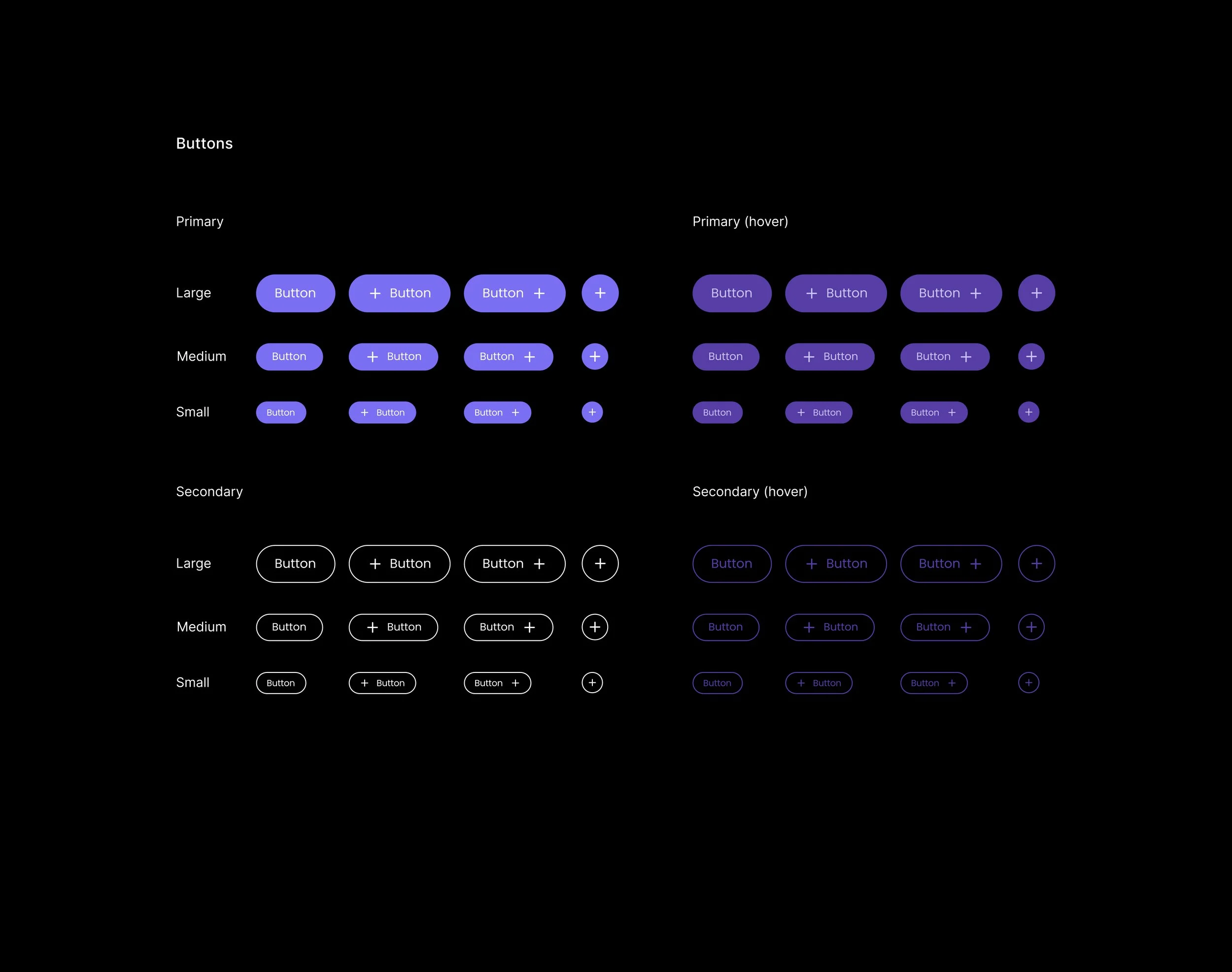
The interface logic focused on clear CTAs, visible pricing, reduced duplication, predictable steps, and a stronger connection between the marketing message and the actual purchase action.
UX Writing & Product Communication
The communication style was built around direct, benefit-driven messages. Instead of describing the subscription in formal fitness-club language, the website explained what users could do with it: start this month, train when it is convenient, use club zones, test the format, and avoid a large upfront payment.
The tone had to feel younger and more accessible, but still credible for a national fitness brand. This balance helped the product avoid two extremes: looking too corporate for young users or too playful for an established company.
The result was a product communication system where text, tariff logic, visual hierarchy, and CTA placement worked together to support conversion.
Responsive Design
The website was designed for both desktop and mobile use. This was critical because the target audience is likely to discover the offer through mobile-first channels: social media, ads, messengers, search, and direct links.
The mobile version needed to keep the same product logic while making tariff comparison, club selection, and purchase actions easy to complete on a smaller screen.
The design process included desktop prototype, desktop visual design, mobile prototype, mobile design adaptation, and preparation for development. The brief defined a compressed timeline for concept approval, desktop and mobile adaptive designs, and final handoff.
Outcome
The final result was a new communication and website system for the Fitness House monthly subscription product. The project helped turn the offer into a clearer, more modern, and more competitive product experience.
The new system gave Fitness House a stronger way to speak to younger and more flexible audiences without losing the trust of an established fitness network. It connected brand communication, tariff logic, visual identity, and purchase flow into one consistent journey.
Instead of simply redesigning a page, the project reframed the subscription as a product: with its own audience, value proposition, tariff logic, visual language, and conversion path.
Business Value
The work helped Fitness House address a strategic challenge: how to stay relevant for a new generation of clients in a market where competitors compete not only through gyms and equipment, but through flexibility, simplicity, visual communication, and digital experience.
By making the subscription easier to understand and easier to buy, the project reduced barriers for users who were not ready for an annual membership. This created a stronger entry point into the Fitness House ecosystem and supported future upsell to longer-term memberships, additional services, and regular club usage.
The project also strengthened the brand’s ability to communicate modernity. A clearer website, more energetic campaign system, and better tariff presentation helped Fitness House compete with newer fitness brands while using its existing advantages: scale, trust, club network, pools, group classes, and established infrastructure.
Exact commercial metrics are confidential, but the work was aimed at improving subscription conversion, tariff comprehension, and engagement among younger audiences by simplifying the offer, modernizing the visual language, and connecting the campaign message directly with the purchase flow.
Conclusion
Fitness House shows how an established brand can use product thinking to stay competitive in a changing market. The project was not only about making the website look newer, but about rebuilding the way the subscription product was explained, positioned, compared, and purchased.
The process started with the business problem: a strong legacy brand needed to become more relevant for younger users and compete with newer fitness products built around flexibility, digital simplicity, and modern visual language. Through competitor analysis, audience research, offer restructuring, brand communication, UX design, and website development, the monthly subscription became a clearer and more attractive product.
The final system helped Fitness House communicate a new value proposition: fitness without long-term pressure, with transparent monthly plans, familiar club infrastructure, and an easier path to start. This made the brand feel more accessible to the desired audience while preserving its core advantage — the scale and trust of one of the country’s best-known fitness networks.